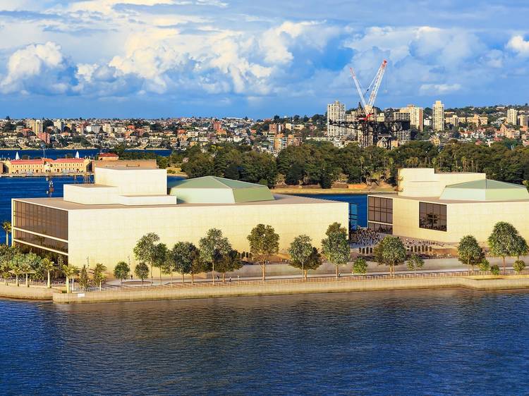
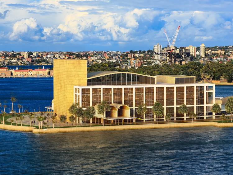
Philadelphia Collaborative Group's design
Photograph: NeoMam Studios/Budget Direct Travel Insurance

Seven Sydney Opera House designs that never saw the light of day

Australia's most famous building could have looked very different

Alannah Le Cross
Advertising

With its iconic design that looks like a carefully balanced assemblage of white shells (or to some, a rack of stacked dishes) on Bennelong Point, the Sydney Opera House – Australia's most famous landmark and a UNESCO World Heritage-listed site – is an indisputable masterpiece of human creativity.

More than 200 designs were submitted when then state premier Joseph Cahill announced an international competition to build a ‘national opera house’ at Bennelong Point in February 1956, and the story behind the design we know today is filled with so much drama it could rival any opera you’d see on its various stages.

Relatively unknown, 38-year-old Danish architect Jørn Utzon won the competition with his sculptural design (one of 12 submissions considered), which would go on to transform not only his career, but also the image of the nation. Sadly, Joseph Cahill would never see his dream realised – the premier died before construction was completed, 17 years after the design competition was held. Even Utzon himself would also never see his masterpiece realised. After a stoush with the minister for works over spiraling costs, Ultzon resigned and left the country, never to return.

But what would city life be like if one of the other 222 competition entries was picked? The cultural institution taking pride of place at Circular Quay could have an entirely different vibe. UK-based creative studio NeoMam unearthed seven of the best entries and created these incredible digital renderings, as commissioned by Budget Direct Travel Insurance, to give us a glimpse of just how differently Sydney could have looked.

It is interesting to note that no limit was set on the budget available to build the winning entry. The contest allowed architects to enter any number of drawings, as long as they were in black and white. It was also pointed out that architects would need to allow space for at least 100 cars to park on-site – mostly those of the orchestra.

In search of more beautiful architecture? Check out the 12 most beautiful buildings in Sydney.

How the Sydney Opera House could have looked

1.  Philadelphia Collaborative Group's design

This brutalist design was the runner-up of the competition. Inspired by a nautilus shell, it consists of an ascending spiral form with full height windows, topped with a roof made from folded concrete covered in copper. The group behind the design, described as a "pick-up band", was formed by seven men, mostly Americans in the architecture trade, and a visiting critic from France. The design group Geddes Brecher Qualls Cunningham (GBQC) was a result of the group working on the Sydney Opera House; the firm would later earn the profession’s highest honor.

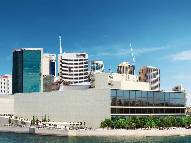
2. Paul Boissevain and Barbara Osmond's design

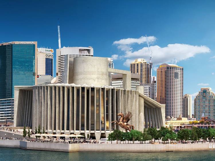
This boxy concept from the Dutch-British husband-and-wife architectural duo looks rather conservative next to the pearly seashells from Ultzon and the Philidelphia Collaborative, which might be what bumped it down to third placed. However, the judges were impressed with the human scale of the two buildings, which are separated by a courtyard, and the promenade. The design, with its emphasis on walking, is reminiscent of the tilted ground-to-roof walkway of the Oslo Opera House in Norway, which was built fifty years after Boissevain and Osmond’s unrealised vision.

Advertising

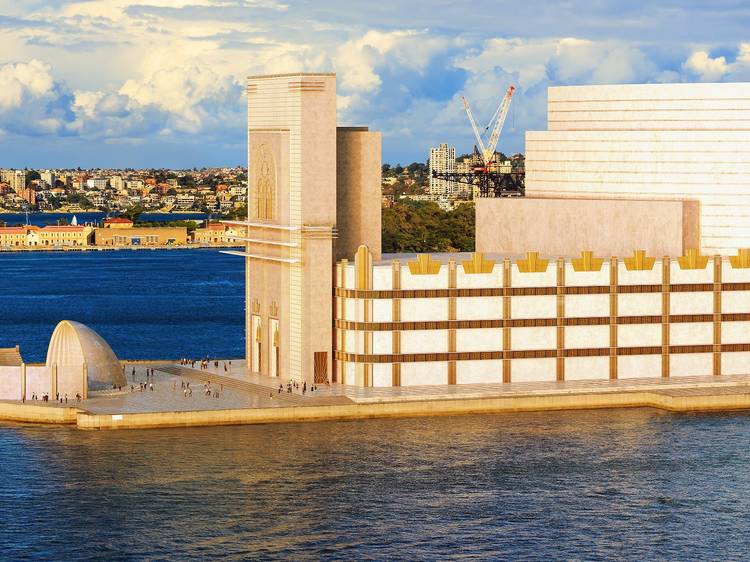
3. Sir Eugene Goossens' design

Okay so, this art deco design was never entered into the competition – but the bloke who dreamed it up would have had some considerable sway to get it across the line. It's the work of English composer Sir Eugene Goossens. A key advocate for a new opera house, Goossens moved to Sydney in 1947 to take up the position of conductor of the Sydney Symphony Orchestra. He was also the director of the NSW State Conservatorium of Music. After two decades of conducting orchestras in big, fancy, purpose-built buildings, he arrived to find our local orchestra performing in the comparatively inadequate 1889 Sydney Town Hall. So he knocked up this design, with an outdoor music bowl out the front.

4. László Peter Kollar and Balthazar Korab's design

This bold design cracked fourth place in the competition and was the highest ranked Australian entry. The judges commented on the project’s "very skilful planning". Both Kollar and Korab were also refugees, having independently fled from the communist regime in Hungary. Kollar was an architect and professor who lectured at the University of New South Wales until his death in 2000. Korab was prominent in architectural photography and was based in Detroit for most of his career. His work is said to have captured the moodiness and romanticism of even the most austere buildings. Kollar was actually a big fan of Utzon’s vision, and later became chairman of the ‘Utzon in Charge’ Committee. During the '60s the committee campaigned on Utzon’s behalf in his disputes with the New South Wales government (see page 6 of this UNSW magazine for more on the story).

Advertising

5. Stanley Wayman Milburn and Eric Dow’s design

This submission was not too dissimilar from Boissevain and Osmond’s box-shape-with-promenade idea. But this English duo tucked their promenade under the raised building and put a helicopter pad up on the roof, presumably in case the conductor needed to get somewhere in a hurry. Both Dow and Milburn apprenticed at W & T R Milburn, Stanley's father and uncle's architectural firm in Sunderland. The firm split in 1947 and it is thought that this was because Stanley wished to seek larger commissions through entering competitions. He was unsuccessful in winning other competitions, but he eventually won the Welsh Medical School at Cardiff. The job was incomplete at his death in 1961.

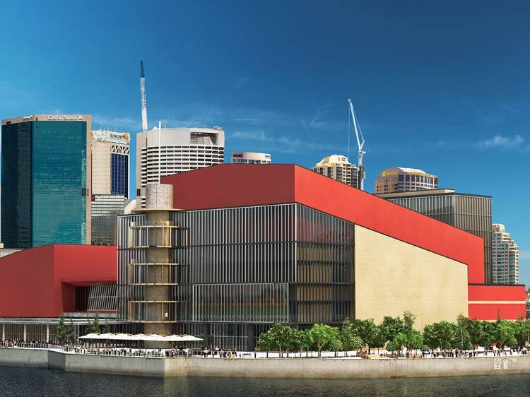
6. Vine and Vine’s design

This English company's sprawling opera house was made up of two individual auditoriums, separated by a foyer-restaurant area, with a sunken plaza by the waterside and a vivid red facade. But the judges didn't favour the two-hall design, and so we'll just have to imagine how breathless we'd get on that strange spiralling stairwell off to one side.

Advertising

7. Kelly and Gruzen’s design

While the sunken courtyards echo the Vine team's design, there's a certain Vegas-esque pizzazz to this American group’s entry. This design features a heck of a lot of concrete and glass, which seems to be a bit of a signature for the firm, which became known for many types of architecture across the United States, both public and private, with a focus on educational structures. The pair also designed what could well be New York's answer to Sydney's Sirius Building – Chatham Towers, a Brutalist beacon built in Lower Manhattan in 1965 as design-forward housing for middle-class residents.

If you liked this, check out these rejected visions for Sydney

Recommended
    You may also like
    You may also like
    Advertising