[title]
While dining out for the big recent revamp of our EAT List—our comprehensive list of the best 100 restaurants in New York right now—one thing became clear: The age of white tablecloths is over.
It would be too simple to describe the way that some of the city’s most exciting dining destinations have evolved their interior design as being Instagram-friendly. Surely, that plays a role: it’s a built in marketing tool that helps spread the word about the great food. But part of why Bao Ong and I dramatically updated our EAT List in our new roles as the food and drink editors was that we were tired of these stuffy, exorbitantly expensive spots oddly making their way onto Time Out New York's list when that's not a reflection of how most New Yorkers enjoy dining out. Perhaps now more than ever, 2019 diners are just looking for fun places that can feel like a second home. And that feeling of accessibility is more and more a story being told, in part through considered interior design choices.


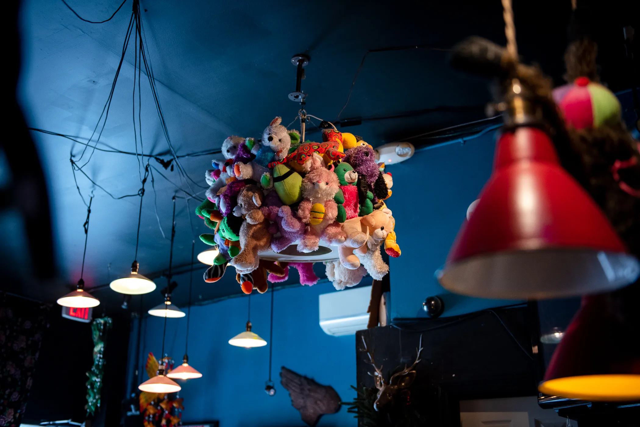
That’s definitely the feeling at Pata Paplean (#19 on the EAT List), which looks nothing like any other Thai restaurants in the city. Walking into the quirky Elmhurst, Queens space is like entering an eccentric living room of someone who knows all the best flea markets around the world. You'll spot a light fixture made of stuffed animals, tattered couches covered in mismatched psychedelic fabrics and even a planter made out of Big Bird’s head.
Similarly, Paulie Gee’s Slice Shop (#9 on the list) is a joy to be in. There are slime green glitter stools, and Formica-style benches in a bright orange hue, bringing to mind the color scheme of Nickelodeon just as much as the true, old-school pizza joints, which owner Paulie Gee grew up working in back in the ‘70s.
MeMe’s Diner (#54) is billed as a queer-friendly space and has an instantly homey, inclusive feel. Instead of shelling out thousands on a designer, owners Bill Clark and Libby Willis did it all themselves, with some help from friends and family. Wares were sourced at a thrift shop in Provincetown, and there’s a disco ball and portraits by one of the co-owner’s grandparents from their art school days.

At Atla, (one of the few fine dining-ish places on this year's list, ranked at #7) the design first appears simple: charcoal walls with verdant accents that allow the moody mole negro with ricotta to take the stage. But a closer look will reveal small magical realist illustrations on the menu, in the corner of the bathroom and low-to-the-ground on a back wall by Mexico City-based artist Rachel Levit Ruiz. In a way, the thoughtful design touches help prove Atla’s thesis: They show a more nuanced portrait of what a Mexican and Central American restaurant can look and taste like.
Mission Chinese (#60) takes this one step further. Back when Angela Dimayuga was the restaurant’s executive chef, she was instrumental in developing the space’s distinct aesthetic, including the first ever indoor mushroom farm installed in a restaurant. (It glows like a museum casing filled with alien-like pink oysters and lion’s mane.) Dimayuga has since departed from Mission Chinese, but owner Danny Bowien’s expansion to Bushwick has its own design-forward vibe, more Matrix-y and club-like, with shifting LED lights and videos of mukbang, the Korean food fetish phenomena.
Some restaurants that made the cut for this year's EAT list, like Maison Yaki, Atla and Kopitiam, even made it to our list of best looking restaurant bathrooms. At Kopitiam (#59) the unique design was based on the chef's bathroom back home in Penang. "That’s why the sink is around 3ft. tall. Even the tiles were shipped in from Malaysia. The sinks were originally fishbowls that we drilled drain holes [into]," writes the restaurant on Instagram.
Treating the restaurant as a gallery is by no means new. Just look to Gordon Matta-Clark’s artist-run restaurant in Soho back in the 1960’s called FOOD. Or, artist Antoni Miralda’s old El Internacional, a Spanish restaurant on Tribeca’s Walker Street, which came to be a hangout for Downtown legends like Jean-Michel Basquiat. (Among other crazy details, there was a Lady Liberty crown puncturing foodstuffs showcased in the window display.) But this year interior design has become an essential tool for restaurants in the highly-competitive food scene to define themselves as spaces in defiance of the old-guard. Where once homogeneity austere interiors were common, today, both in the back and front of house, individuality and personality is finally allowed to shine through.
In fact, the playfulness at some of the city's best restaurants feels truly radical.
