[title]
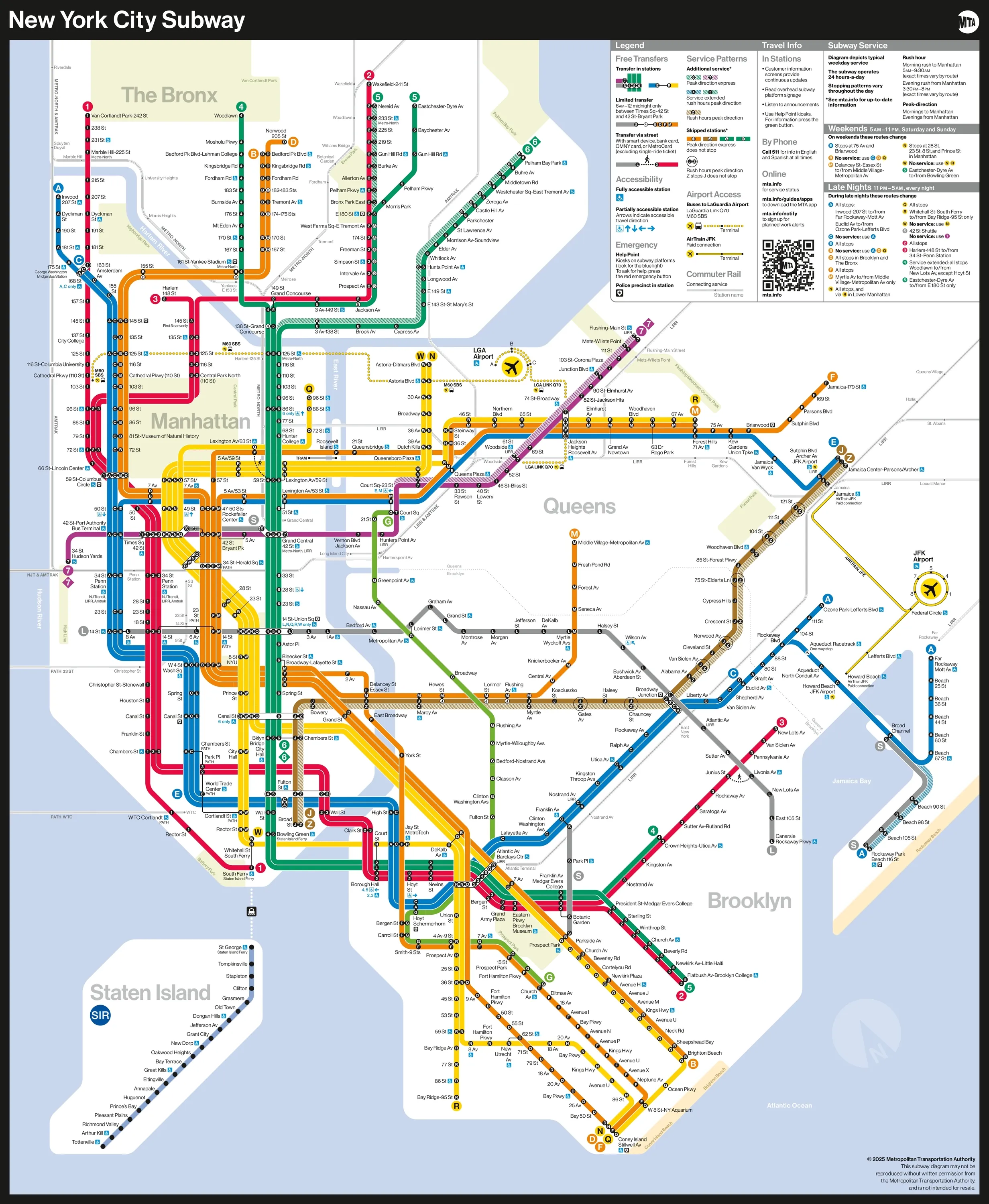
It’s a big moment—there’s officially a brand new subway map, and it’s the first new design since 1979!
The Metropolitan Transportation Authority (MTA) unveiled the map today, giving New Yorkers a first glimpse of what they’ll be using from now on as they traverse the underground system.
RECOMMENDED: Metro-North’s New Haven line to NYC is now 10 minutes faster
“The new MTA is focused on a quality, 21st century customer experience, and it's about time our map caught up,” said MTA Chair and CEO Janno Lieber in an official statement. “The new version is much easier to read while also reflecting all the enhancements we’ve made over the years.”
Here it is:

The new map apparently takes inspiration from previous versions (primarily, the 1972 Massimo Vignelli map and later updates) while simplifying essential travel information in a “readable, bright, bold and orderly manner,” said the MTA.
Designed by the agency's Creative Services Mapping Department, it uses bold, straight lines so the eye can follow the subway lines more easily, especially folks seeing it on screens. The colors—the official MTA brand colors used in the 1979 and 1998 maps—pop off the white background and the black dots representing the subway lines are meant to be ADA-friendly so those with low vision or cognitive disabilities can read it more easily.
The map’s legend now contains more information about accessibility, transfer and safety, as well as a QR code that leads to the MTA website on your smartphone browser.
The new creation is already being displayed on stations’ digital screens and will soon be shown on board R211 cars. Physical maps in the system will be replaced with the new version in the coming weeks, but worry not: both the redesigned map and older versions are available for download on the MTA website.
What do you think? Is the new map more legible and eye-catching? Or is it more confusing and hard to read? At the very least, it’s pretty!

