[title]
You can’t hide an ugly building.
That’s what Buildworld, a building supply website, says in its recent report of the world’s ugliest buildings. The bold article titled “Global Eyesores” calls out one NYC structure as one of the worst offenders in the United States.
RECOMMENDED: For the first time, a statue of a woman sits atop this Manhattan courthouse
Buildworld curated a long list of buildings from the U.K. and the U.S. that are often “said to be ugly.” They found design-themed tweets about these buildings and used a sentiment analysis tool called HuggingFace to analyze the percentage of tweets that were negative about each building’s design.
What did it find?
The Scottish Parliament Building in Edinburgh is the world’s ugliest building, according to Twitter users. The J. Edgar Hoover Building in Washington, D.C., is America’s ugliest building, and the Ryugyong Hotel in Pyongyang, North Korea, is the ugliest building outside of the U.K. and U.S.

But where does NYC fall in all of this?
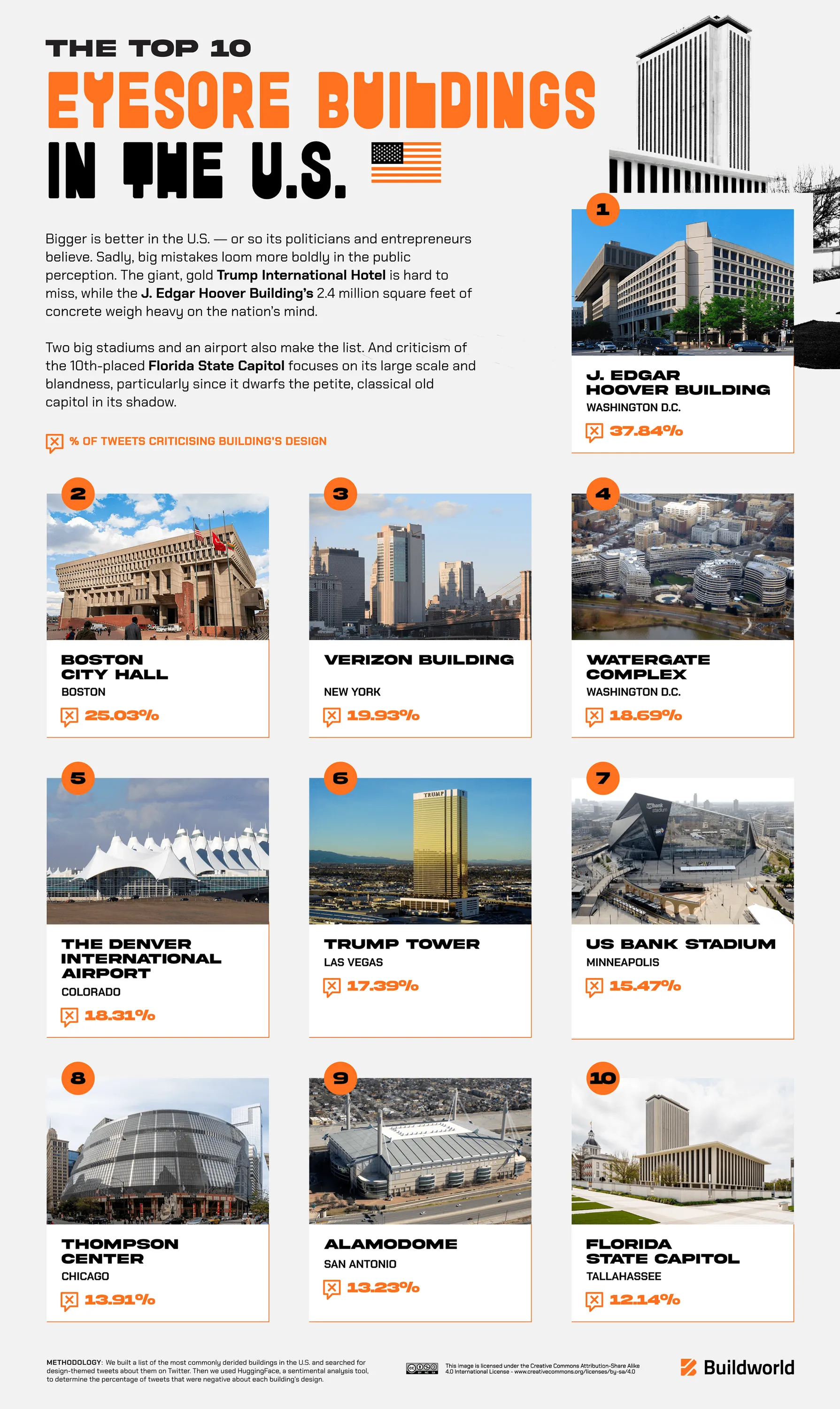
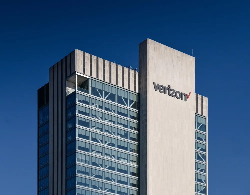
The Verizon Building on Pearl Street is reportedly the third ugliest building in the U.S. and sixth in the world (U.K. and U.S.) with almost 20% of tweets negatively commenting on its appearance.
“Not to be confused with the Verizon Building on West Street, the Verizon on Pearl Street has long been a ‘doer-upper’ without ever becoming an acceptable sight for New York’s eyes,” Buildworld writes. “When an investment firm bought the much-maligned 1975 telephone exchange in 2007, a reporter told the CEO: ‘Mr Pariser, you have a challenge cut out for you — turning a GE dishwasher into an office building.’ The firm failed to meet the challenge and re-sold it for a fraction of its intended price.”

Tweets we found ourselves are pretty scathing.
Found the base of that stupid verizon building pic.twitter.com/6IcNQsAllh
— Sebastián Beán (@sebbean) March 13, 2014
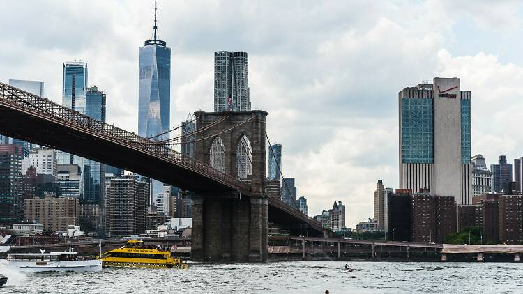
Verizon Building still out here ruining every shot of the NY skyline https://t.co/9GcG9M17XG
— Jack (@JFK_24) April 16, 2020
That hideous Verizon building.
— Pfizer Papi (@hugitoutbitch) May 20, 2014
The damn @verizon Building always ruins the shot when you try to get the Tower and the Brooklyn Bridge in the same frame.#nyc #architecturephotography pic.twitter.com/wKcYzRRFAd
— J 🍸 (@212NY) October 31, 2018
The building has long been known as a “blight” to the NYC skyline, according to 6sqft.com. The building was erected in 1975 and reaches 540 feet into the sky. It’s no longer owned by Verizon, but by Sabey Data Center Properties, which calls it “iconic architecture” on its website. In 2016, it updated its facade, switching out some of its limestone for floor-to-ceiling glass curtain walls across the top of its four faces, 6sqft.com says.
The problem, Buildworld says, is that American buildings are all about being as big as possible, citing “ugly” buildings like Trump International Hotel in Las Vegans and the J. Edgar Hoover Building in D.C.
Why does this even matter?
According to Buildworld, “bland architecture on a massive scale makes life dull for locals and tourists alike. But a dramatically ugly building can spark a passionate ‘love to hate’ affair.”
They say people love to vent about big, awful buildings because they come to represent wealth, wasted public funds, big government or misdirected councils and “a world that is tough to navigate or even wilfully hostile.”
But maybe, just maybe, an ugly building is just…ugly.

