[title]
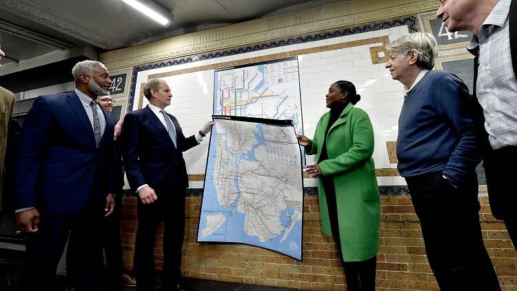
If you didn’t see it on your way to work this morning, the Metropolitan Transportation Authority (MTA) has unveiled a new subway map—and it’s already in use.
The new map takes inspiration from previous versions (primarily, the 1972 Massimo Vignelli creation and its later updates) while simplifying essential travel information in a “readable, bright, bold and orderly manner,” said the MTA.
RECOMMENDED: See the brand-new subway map that the MTA will install on every train in the upcoming weeks
But you may be wondering what the differences between the various maps are. That's why we are here.
What was the original NYC subway map?
When the subway opened in 1904, maps just depicted the routes of the individual companies that ran them—the Interborough Rapid Transit Company (IRT), the Brooklyn-Manhattan Transit Company (BMT) and the city-owned Independent Subway System (IND), according to 6sqft.com.
When these companies were consolidated in the 1960s, a new map was created using a “Beckian grid.” Named after Harry Beck, who standardized the London Underground map using 45- and 90-degree angles, the creation was then redesigned in 1972 by Vignelli—but not without controversy.
The new map seemingly distorted the city’s geography, put stations in the wrong places and colored surrounding bodies of water beige—all in a bid to clarify the information. It didn’t go over well, so Michael Hertz then worked on a new, more geographically accurate map in 1979, which has since been used as the basis for all updates until this week.
What’s new in the 2025 NYC subway map?
Designed by the agency's Creative Services Mapping Department as inspired by the Vignelli map, the new layout uses bold, straight lines to help the eyes easily follow directions, especially when seen on a screen.
The colors—the official MTA brand colors used in the 1979 and 1998 maps—pop off the white background, while the black dots representing the subway lines are meant to be ADA-friendly so those with low vision or cognitive disabilities can read it more easily.
The map’s legend now contains more information about accessibility, transfer and safety, also, plus a QR code that leads to the MTA website on your smartphone browser.

