

[title]
What’s in a name? Well, a lot.
Brooklyn Museum, which is celebrating its 200th anniversary this year, just unveiled a new logo and branding it says will bring its past, present and future together in one look.
RECOMMENDED:
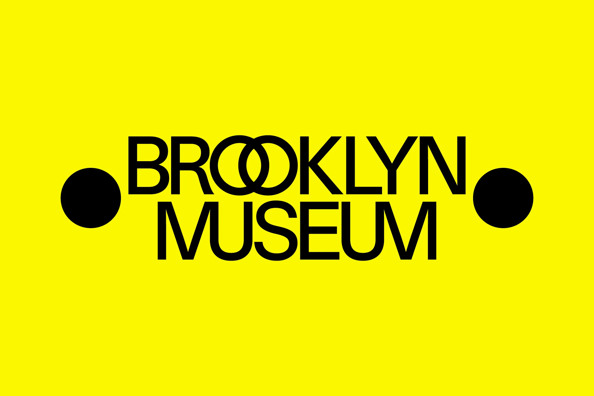
The new logo uses modern sans serif typeface, new ligatures and incorporates the two dots that surround each name—of ancient philosophers, playwrights, and poets—on the building’s facade.
“This reference to writers and thinkers links to our beginnings as a library and to the intersectional nature of the arts,” the museum said in a press release. “In every application, the dots appear at least twice, an echo of the two O’s in Brooklyn.”
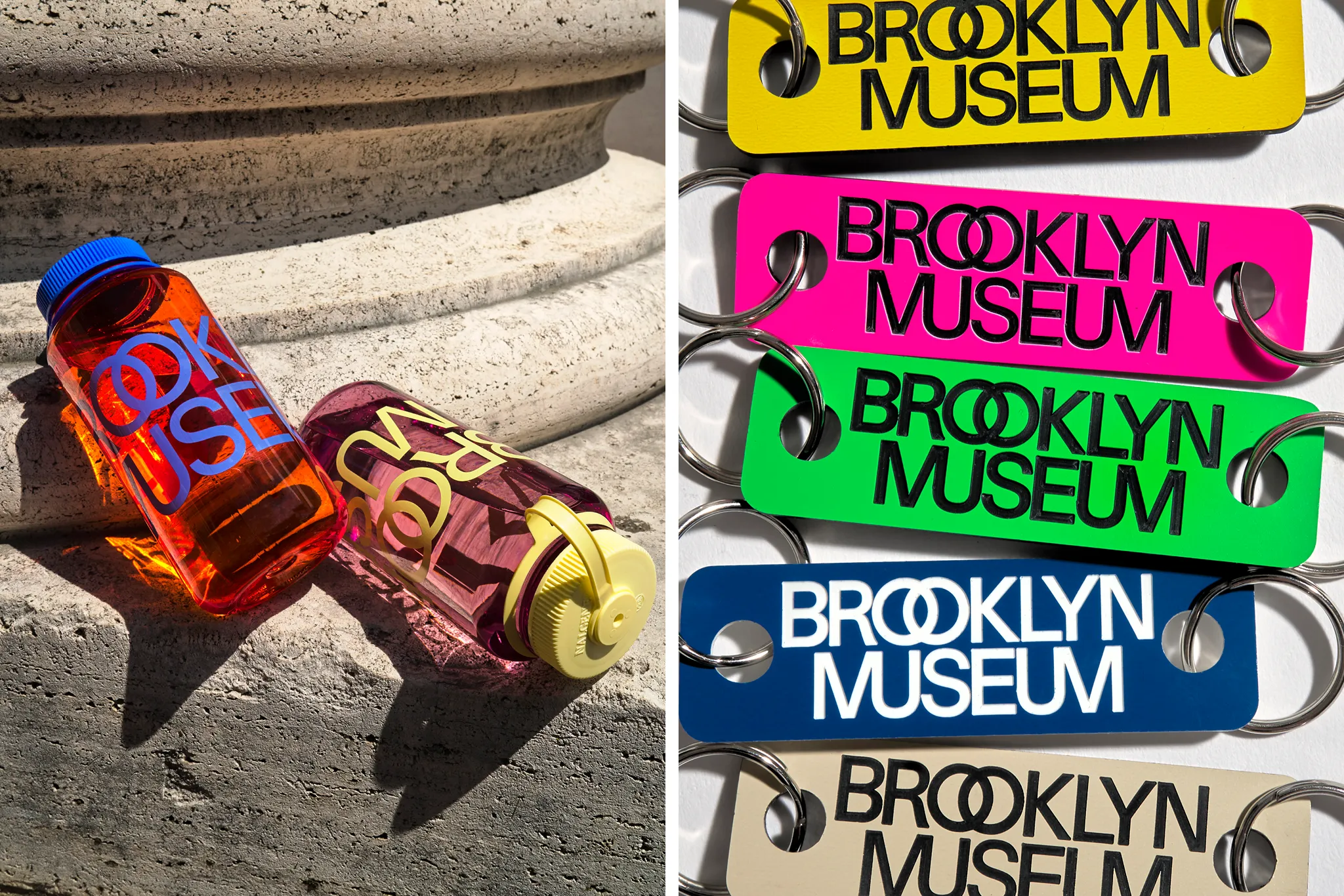
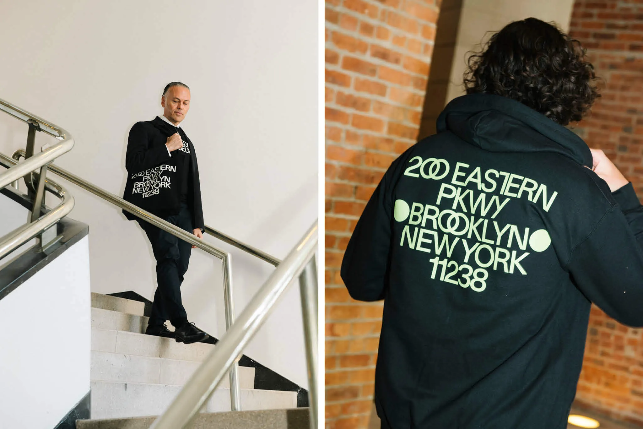
The double O’s in Brooklyn are now intertwined M’s and U’s in Museum are linked. There’s a new color palette too, which incorporates the grays of its limestone building and brighter colors for a “distinctly Brooklyn vibe.”
“The two dots, overlapping letters, and kaleidoscopic colors all convey the Brooklyn Museum’s identity as a place where a multiplicity of ideas, identities, and points of origin converge,” the museum said. “These design elements nod to the encyclopedic collection as well as the interconnected roles the Museum plays for its multifaceted audiences: art museum, educational center, forum for ideas, weekend hotspot, and many more.”
The new logo and branding was designed by Brooklyn-based graphic design studio Other Means with help from in-house designers after more than a year of research and discussion.
Last time there was a major museum brand redesign that made headlines, it was 2016, when The Met introduced its new logo. Its new M was made to look like da Vinci’s work, but Vulture called it “a red double-decker bus that has stopped short, shoving the passengers into each other’s backs.” Other critics aired their grievances and The Met justified its decision in the Times.
“It’s a changing institution; the world is changing around us, and I think it’s time for the Met to move forward,” said Daniel Brodsky, the museum’s chairman, back then.
The Brooklyn Museum said something similar today.
“The ways that audiences are engaging with museums are expanding, and we needed a new brand that meets the demands of the day, honors our rich history, and brings a whole lot of energy,” said Anne Pasternak, Shelby White and Leon Levy Director of the Brooklyn Museum. “And there’s no better time to launch it than our 200th anniversary!”
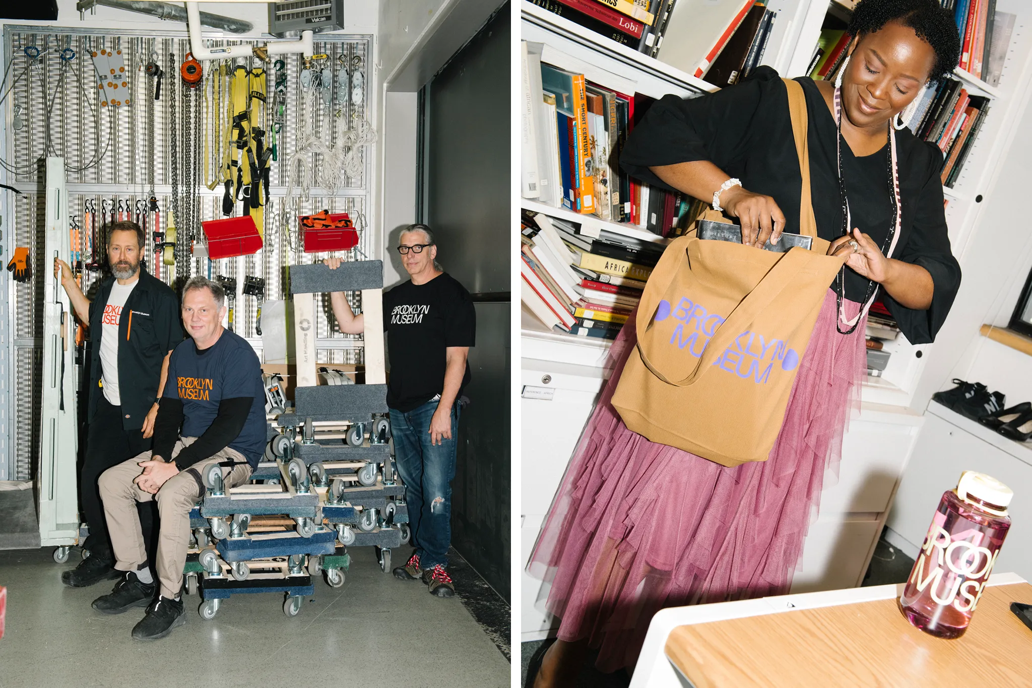
The even cooler thing is that you can grab some sweet merch featuring the new logo and colors at the museum’s shop, including T-shirts, hoodies, water bottles, tote bags, stickers, mugs, key chains and more.
What do you think of the new branding?