“Here you leave today and enter the world of yesterday, tomorrow and fantasy.”
Cross underneath the train tracks just inside Disneyland’s entrance and you’ll come across that familiar greeting. Since 1955, Disney has whisked its visitors out of Southern California and into recreated and reimagined worlds. But in the years since its opening, “today”—as in Disneyland’s vision of 1955—has become an integral part of the park’s trip to “yesterday.”
Midcentury modern and its clean, simple, yet sophisticated aesthetic has become de rigueur for LA’s high-end dining scene, whether at Viviane, the Arthur J or Now Boarding. And you can certainly step back into the aesthetic era with a trip to the Stahl House, a baseball game at Dodger Stadium or a movie at the Cinerama Dome. But Disneyland—outside of maybe Palm Springs—channels the spirit of midcentury more so than any other LA destination.
Tomorrowland, as it originally looked around the park’s opening, was a World’s Fair-like monument to the Space Age, brimming with post-war optimism. But it was also home to some fantastic of-its-time architecture: the gorgeously Googie swooping rooflines of Rocket to the Moon, the midcentury modern Monsanto Hall of Chemistry and the curvilinear, glassy House of the Future.

Photograph: Courtesy Corbis

While contemporary changes have removed some of its Space Age relics and instead introduced a hodgepodge of retrofuturistic touches, you can still find midcentury leftovers throughout the themed land. Catch a ride on the Disneyland Railroad and you’ll spot the Tomorrowland station’s wing-shaped, perforated supports. An interpretation of Tomorrowland Terrace’s original swooping spires sits atop the Jedi Training Academy. And the enthusiastic “There’s a Great Big Beautiful Tomorrow” may no longer bellow from the Carousel Theater, but the streamlined monorail still glides nearby.
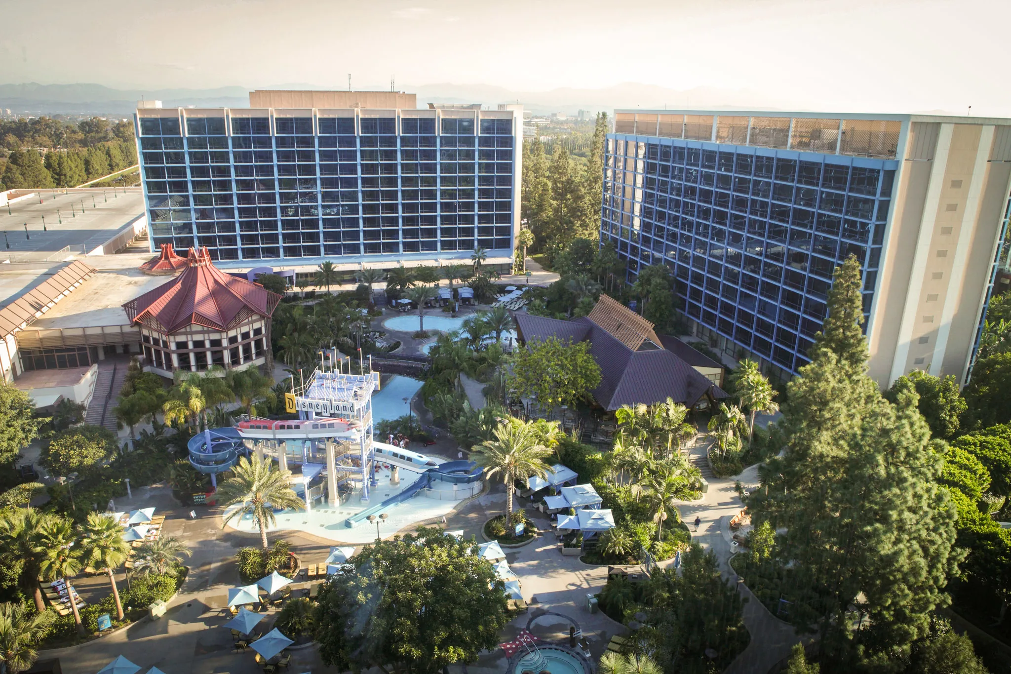
Follow the monorail outside of the park and you’ll wind up near the Disneyland Hotel, a jetsetting high-rise originally designed by Pereira & Luckman, the same architecture firm who’d later build LAX’s Theme Building. Though the resort’s original structures have since been remodeled, its current appearance pays tribute to its midcentury origin thanks to its sleek exterior, vintage signage and an homage to tiki culture, anchored by the tiki bar Trader Sam’s.

Photograph: Courtesy CC/Wikimedia/Sam Howzit
That midcentury tiki obsession is most obvious in the Enchanted Tiki Room, a thatched roof spectacle hatched from an early ‘60s fascination with all things Polynesian. Inside the Disneyland ride, singing totem poles and drumming tikis complement a quartet of talking animatronic macaws who lead the show’s Hawaiian soundtrack—including a brisk whistle-a-long verse that can only be explained by an assumption that everyone was an expert whistler in 1963.

Photograph: Courtesy Disney
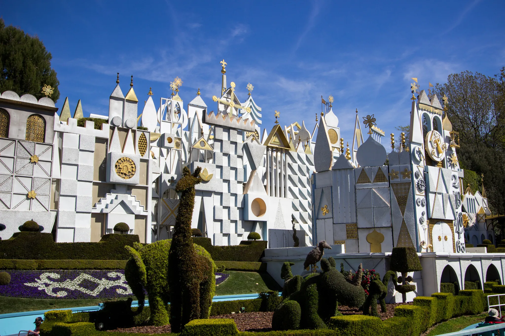
But it’s Disneyland's other earworm that may just be its finest piece of midcentury design. Most people fixate on the multicultural singing dolls and their bright tune, but It’s a Small World's greatest asset is its artwork.

Photograph: Courtesy CC/Flickr/HarshLight

Photograph: Courtesy CC/Flickr/HarshLight
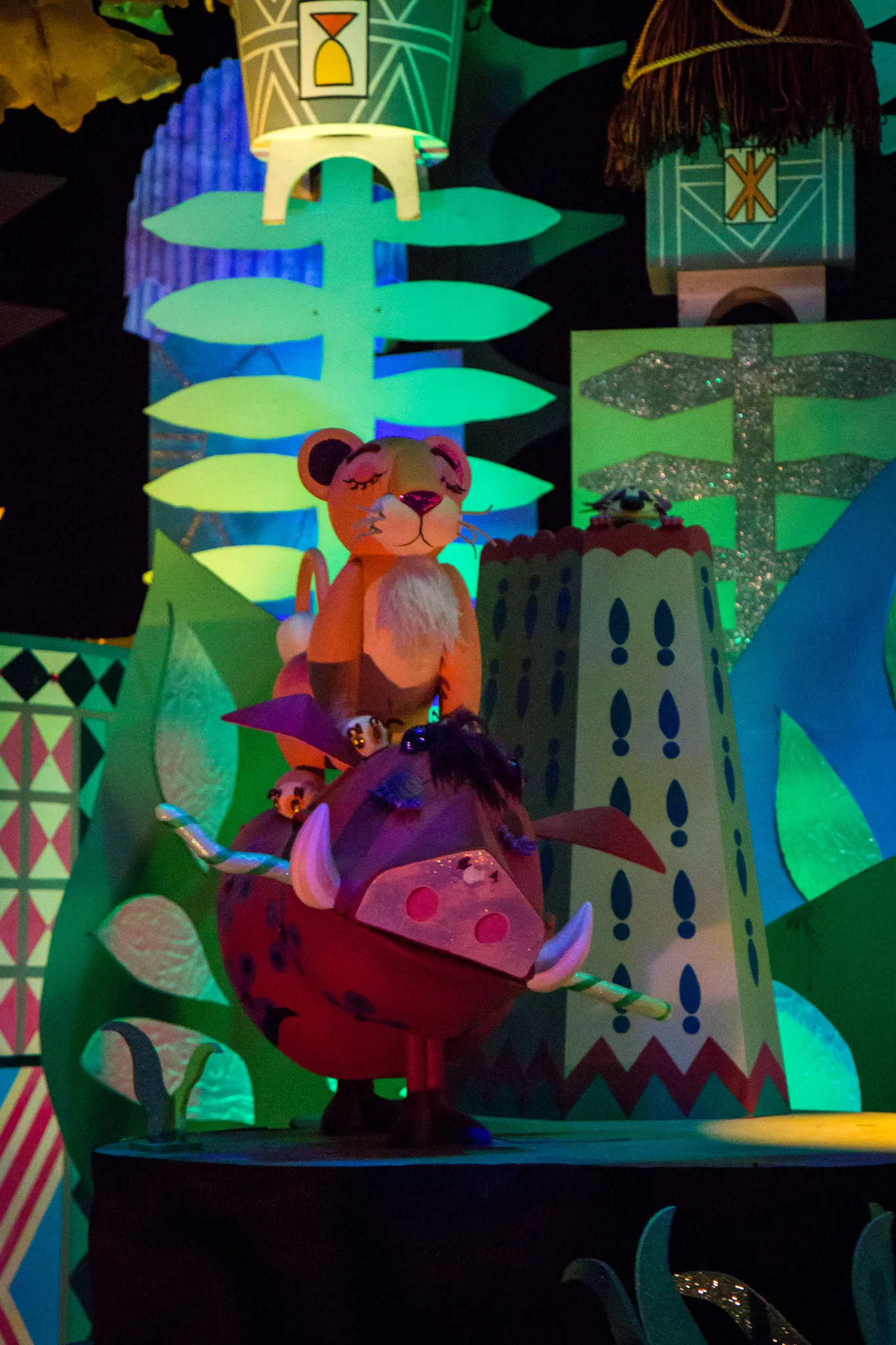
You can thank imaginative Disney designer Mary Blair for the ride's distinctive style. Sunbursts and gold finials adorn the playful, yet exacting exterior. Inside, colorful geometric patterns stand against bold background murals. Like much of Disneyland's best designs, It's a Small World sweeps its riders off into another place entirely and proves that clean and approachable yet sophisticated design can bring boundless joy.
