8500 Melrose.
Photograph: Michael Juliano8500 Melrose.
Photograph: Michael Juliano

The 10 ugliest buildings in Los Angeles

We love you, L.A., but these 10 ugly buildings are just begging for a full-blown architectural makeover

Michael Juliano
Advertising
We typically don’t like to slam L.A. too much; there are enough outsiders and naysayers who already do that for us. This city has a plethora of phenomenal places to see and things to do, but let’s be real—beyond the beaches and the beautiful parks, L.A. can get pretty ugly. We’re not just talking about the strip malls, liquor stores and stucco, but also the city block-sized developments and luxury condos that are an embarrassment to L.A.’s rich lineage of star draftsmen. In no particular order—and with all due respect to their architects—we’re calling out the ugliest buildings in Los Angeles.
 
RECOMMENDED: Looking for some real beauty? Check out our list of the 30 most beautiful buildings in Los Angeles.

The 10 ugliest buildings in L.A.

1100 Wilshire

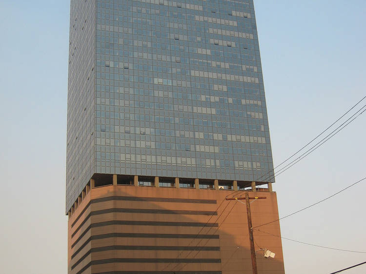
Imagine you’re building a clay-colored office structure. You have 16 stark, rectangular floors finished so you decide to take a break at the bar. A fuzzy number of shots later, you find yourself at the losing end of a bet: The remaining 20 stories will be built as a glass triangular tower. This is the only explanation for the hideously mismatched 1100 Wilshire that we’re willing to accept.

1100 Wilshire Blvd (Downtown)

The Big Blue Scientology Building

In another era, this boomerang-shaped building might’ve made our most beautiful list. The 1928 structure started out as a hospital designed by Eastern Columbia Building architect Claud Beelman; the metalwork above the entrance and the Art Deco detailing are actually quite elegant. But then Scientology came along with a whole lot of blue paint. The creepily clean, garishly Smurf-blue stronghold always seems to have its white blinds shut and its 16-foot-tall Scientology sign illuminated; the result feels straight out of 1984.

1308 L Ron Hubbard Way (East Hollywood)

Advertising

Palms/Motor

We’re sure the residential units in this Palms development are just lovely. From the outside, though, the building looks like a crude 3-D rendering that never had any tactile textures applied to it. It’s an unpalatable mix of medium rare red and creamsicle orange hoisted onto a silvery cylinder.

10329 Palms Blvd (Palms)

Los Angeles Convention Center

As its neighbors rapidly build upward, we're still anxiously awaiting a redesign for the L.A. Convention Center. The tinted entrance atriums are sunny and spacious from the inside, but from the street they look akin to Space Mountain built out of drab, sterile leftovers from a doctors office waiting room. Crawling in traffic on the 110 onramp? Have fun staring at the faded aquamarine paneling on its backside.

1201 S Figueroa St (Downtown)

Advertising

Medici, Orsini, Piero and Visconti Apartments

These four G.H. Palmer-developed condo complexes are regularly ripped a new one for their faux Italian villa look, but they’re far from the only ones to ape the style—see the Montage Beverly Hills and the mac and cheese-colored DreamWorks Headquarters in Glendale. Instead, we find them repulsive for being so isolated and pedestrian-unfriendly; the tall, brick arches at street level offer a lovely view of the parking garage while slanting away from the sidewalk like the base of a castle wall. The skywalks keep any peons out, while the proximity to the 110 raises the question of why anybody would want in. And just putting it out there: the Papyrus-font signage is inexcusable.

Various locations (Downtown)

Koreatown KFC

Whereas a fiberglass doughnut at an iconic doughnut shop carries a certain amount of charm, a programmatic meets postmodern bucket of chicken at a fast food restaurant is about as palatable as, well, a bucket of KFC. Architect Jeffrey Daniels once worked alongside Frank Gehry and it certainly shows in the design—albeit not in a very positive manner.

340 N Western Ave (Koreatown)

Advertising

Hollywood Galaxy

This movie theater-turned-shopping center once served as the unofficial Time Out Los Angeles visitor parking lot—say hello to fake Spider-Man and Jack Sparrow for us as you exit its humid, dark dungeon of a garage. But we don't have much fondness for its design; above ground, it looks like a B-movie spaceship primed for takeoff, with twin staircases anchoring it to the ground. What really gets us, though, is the rotunda’s excess of tile and glass blocks, which gives the complex all the charm of an indoor public pool.

7021 Hollywood Blvd (Hollywood)

Petersen Automotive Museum

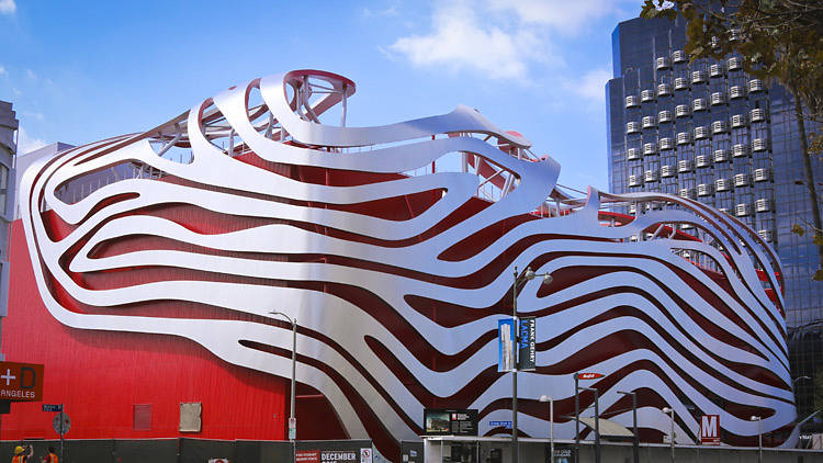
While we love the high-octane displays inside the museum, the exterior of the Petersen is a different story. A 2015 renovation scrapped the original facade, a smooth fin-adorned Welton Becket creation, but technically kept the bones of the building. You'd never know it: The original building has been reduced to what looks like a windowless red shipping container that's been obstructed by a metallic thumbprint. And yet none of that prevented the institution from winning a 2017 American Architecture Award. Just like with cars, beauty is in the eye of the beholder.

6060 Wilshire Blvd (Miracle Mile)

Advertising

8500 Melrose

We’re not the first to bestow such a dubious honor on the Melrose mini-mall, and we doubt we’ll be the last. The alternating black granite and white marble facade looks like Beetlejuice laying on his side—in style-conscious L.A., horizontal stripes are a no-no. The contrasting strawberry-colored accents really put this blocky ‘80s beast over the edge.

8500 Melrose Ave (West Hollywood)

Hollywood & Highland

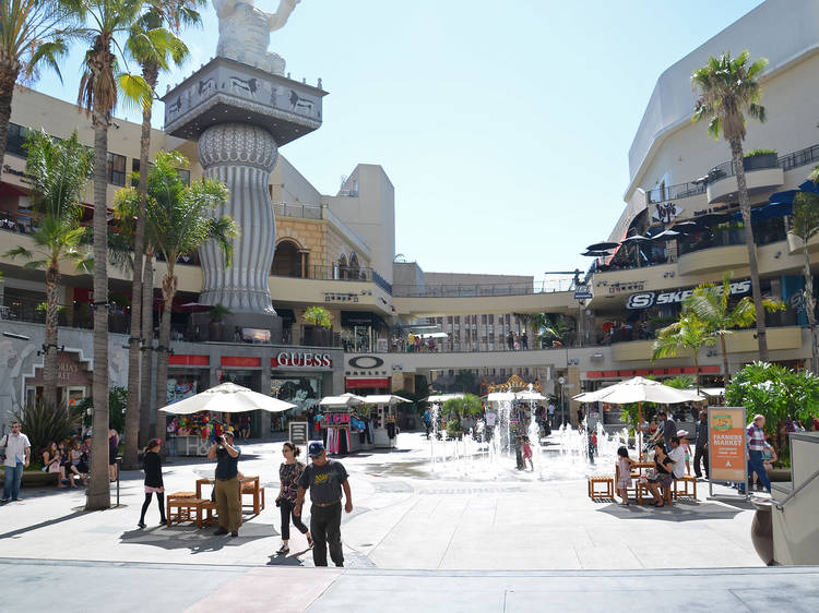
Hollywood & Highland is the architectural equivalent of Rebecca Black’s “Friday”; it’s bad, to be sure, but people love to jump aboard the hate train just because everyone else is doing it.

Not everything about it is terrible: the view of the Hollywood Sign is well-framed, the property is generally well-kept and its construction put the brakes on Hollywood Boulevard’s downward spiral. But it’s also plagued with gargantuan billboards, the entire Highland Avenue side is devoid of life and pedestrian activity, its labyrinthian staircases and escalators hamper wayfinding (not that you’ll find anything appetizing to eat anyway) and its vacuous courtyard hasn’t helped to absorb the hordes of tourists that clog the sidewalks.

Like D.W. Griffith’s Intolerance—the white elephants and Babylonian gate are an homage to the 1916 film—Hollywood & Highland is an expensive mess that can only hope to live long enough for locals' opinions to flip in its favor. Until then, it’s the cobbled together pizza place salad of shopping malls.

6801 Hollywood Blvd (Hollywood)

Looking for more aesthetically pleasing structures?

  • Attractions

Don’t let the stocky skyline fool you: Los Angeles is full of beautiful buildings. We’d like to think that what we lose in height we make up for in diversity, from 18th-century missions to 21st-century institutions. Though it was no easy task, we narrowed down L.A.’s finest Googie gas stations, Art Deco towers and mid-century masterpieces to just 30 of our favorites.

Recommended
    You may also like
    You may also like
    Advertising