

[title]
Tube nerds have got a new toy. Last week a new online map of the London Underground was revealed, and it shows exactly which trains are where at any given time.
When you open the map you’ll see all the familiar squiggly coloured lines (red for Central, dark blue for Piccadilly, etc) and stations represented by dots. On each line, there darker lines representing the trains move from one station to the next in real-time. Pretty cool, eh?
That means you can watch all the Underground traffic, including any delays or blockages, as it happens. It’s also just fun to play around with. If you zoom in, you can watch the trains snaking around a green 3D topography of the city. You can even recognise buildings like the Houses of Parliament, the London Eye and Tower Bridge.
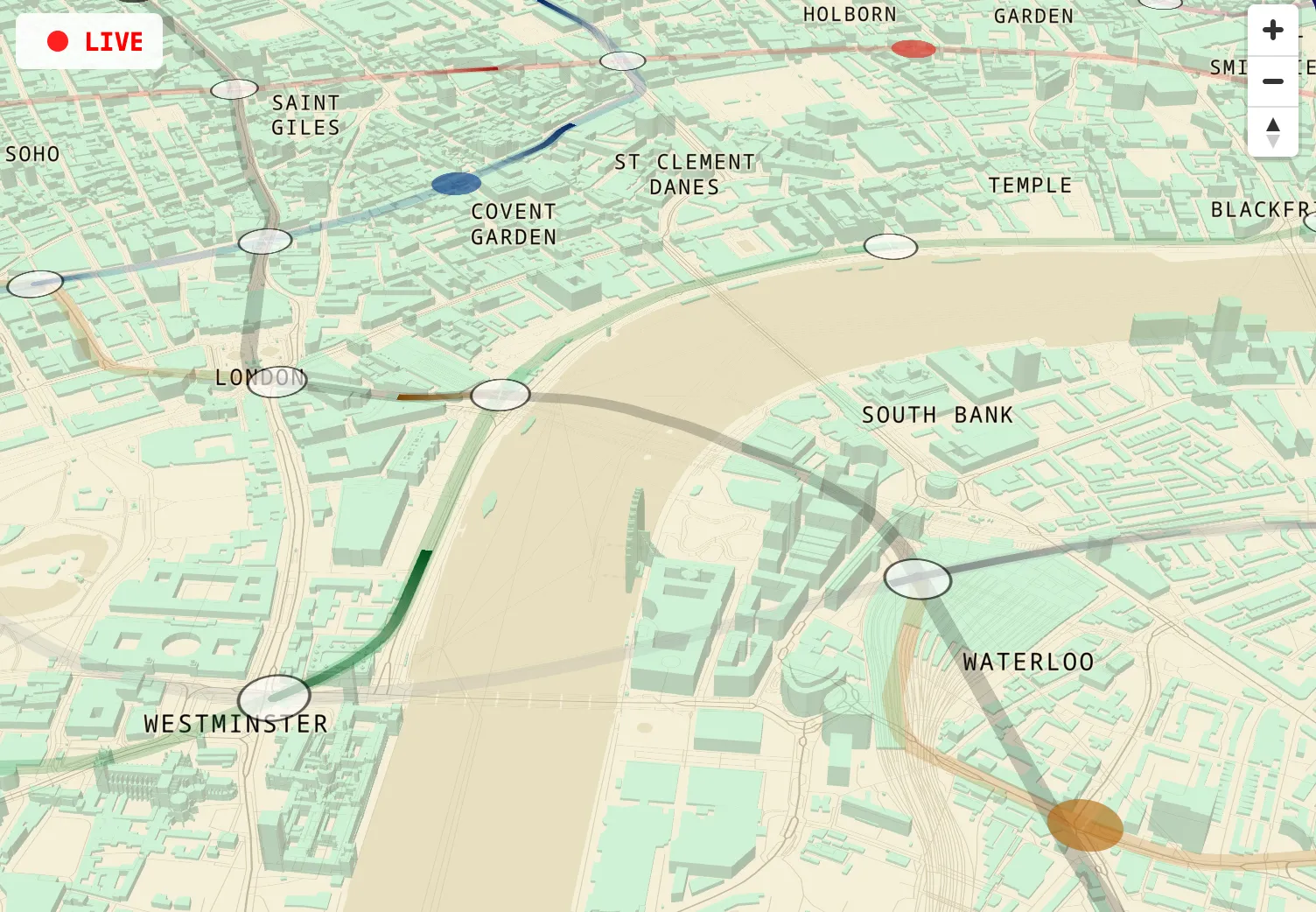
There’s more! Hover over the moving trains and a little information box pops up telling you the exact model of the train, where it’s going to and from, the percentage of its journey that it’s completed and the exact times (to the second) that it is expected at its next two or three stops.
The map was created by engineer and writer Ben James using TfL’s open data. Next time you’ve got a long Northern line journey ahead of you, why not make it more exciting by watching as you zoom under all of London’s landmarks?
🚇 You see the real-time map for yourself here.
Mapped: how much it costs to rent at every London tube station in 2025.
Plus: inside plans for a ‘Welsh tube’.
Stay in the loop: sign up to our free Time Out UK newsletter for the latest UK news and the best stuff happening across the country.