Ten really boring but inexplicably beautiful London buildings

Libraries, bus garages and other civic necessities that have absolutely no business being as fit as they are

Advertising

Ever been on a date with someone who was utterly gorgeous but duller than a Belgian politician listing their favourite types of rice? Well London is full of architectural equivalents – buildings that we wouldn’t expect would get our pulses racing, but that are hot stuff in the looks department. You can find loads more in a new book called ‘England’s Post-War Listed Buildings’ by Elain Harwood and James O Davies (published by Batsford and Historic England), which you can buy right here.

Smithfield Poultry Market, Smithfield

What goes on here, then?
It’s the city’s main designated space for the buying and selling of bird meat, so we’re guessing a lot of weird shit to do with chickens. Oh, and drinking – there’s a bar in the basement.

Why so pretty?
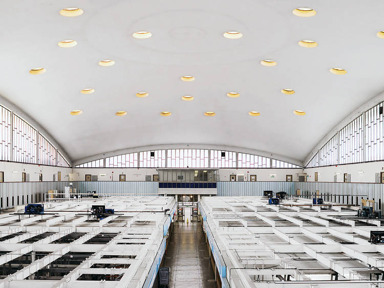
When they were commissioned to replace Smithfield’s old poultry market (which burnt down) in 1961, architects TP Bennett and Son seized the opportunity to make the coolest darn poultry market the world had ever seen. The 70 metre-wide concrete shell roof was the biggest in Europe upon completion, and inspired the design of many more market spaces throughout the 1960s. It’s not hard to see why.

The Finnish Church, Rotherhithe

What goes on here, then?
Praying. Confessing. And, as the only church in country to feature a sauna, a fair bit of sweating, too.

Why so pretty?
Leave it to the Scandinavians to turn the dullest of civic necessities into something out of an interior design magazine. The building is located close to the Surrey Docks – where Scandinavian timber was shipped during the twentieth century – so it’s fitting that stylish wood features abound. God-fearing fans of Nordic design, take note.

Advertising

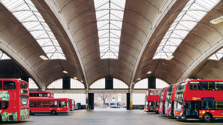
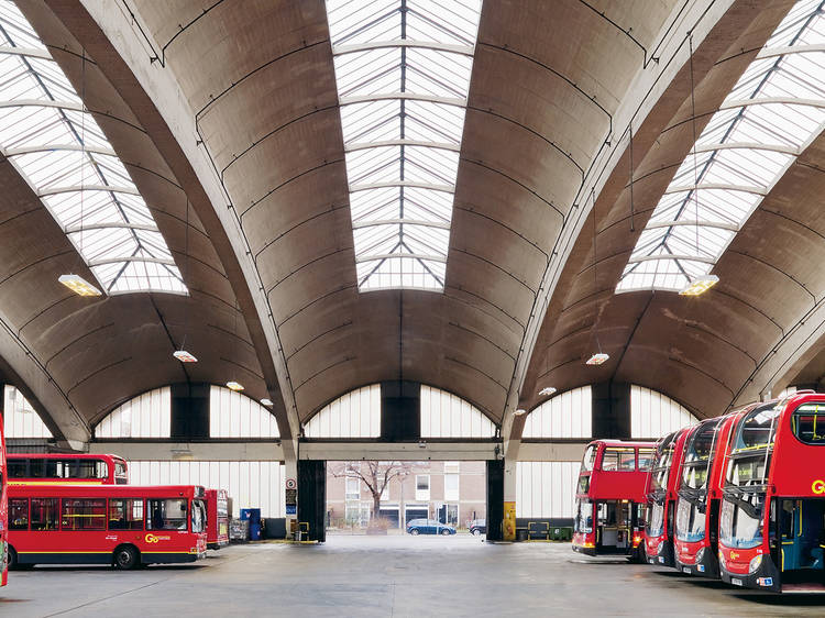
Stockwell Bus Garage

What goes on here, then?
It’s the place where buses go to sleep and where the office pisshead wakes up covered in sick after passing out on his way home to Battersea. In other words, it’s not exactly the sort of place you’d choose to hang out, which is sort of a shame because look at how fit that ceiling is.

Why so pretty?
London’s only grade II*-listed bus garage was completed in 1954, two years after the withdrawal of the city’s last trams. Its distinctive vaulted roof is the work of architects George Adie and Frederick Button, and comprises ten concrete beams linked by a system of supporting ribs. It may only ever be appreciated by south London’s bus drivers, but we suppose there’s got to be some perks to the job.

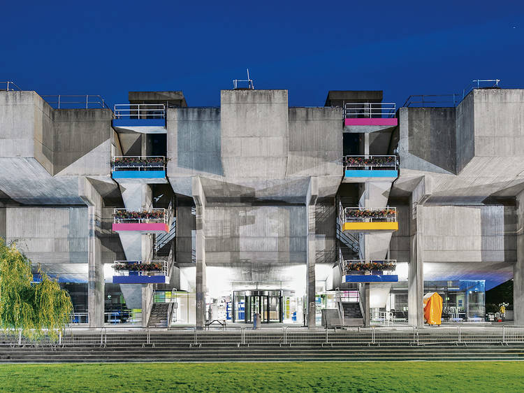
Lecture theatres at Brunel University, Uxbridge

What goes on here, then?
It's a complex of six lecture theatres and a few smaller teaching rooms, where clever types go to learn about clever things. When they’ve not had 14 sambucas the night before and slept through their 8am alarm, that is.

Why so pretty?
When this big, beautiful, Brutalist bastard isn’t terrifying students on a Monday morning, it’s moonlighting as a filming location (credits include ’A Clockwork Orange’ and ‘Spooks’). You can see why directors are drawn to the building, which gained grade II listed status in 2011 – its imposing geometrical form is perfect for instilling a certain sense of inescapable dread (as we’re sure Brunel freshers will confirm).

Advertising

Kensington Central Library

What goes on here, then?
It’s a library, so people pushing glasses up the bridges of their noses, people putting their fingers to their lips and going ‘shhhh’, kids sneakily watching cartoons on their iPhones – that sort of thing.

Why so pretty?
This was the final building designed by English architect E Vincent Harris, who also built the damn fine-looking Manchester Central Library, among many other civic beauties. With nearly 50 years worth of experience behind him when the project began in 1958, it’s no surprise Harris’s swansong is such a stunner – just check out that spacious floorpan and those bold, authoritative pillars.

Elliott School, Putney

What goes on here, then?
It’s a school (now the Ark Putney Academy) in south-west London, so we’re guessing games of tiddlywinks, wedgies, some exams and the odd bit of psychological bullying.

Why so pretty?
From this angle, it looks a bit like one of the sandcrawlers from the first Star Wars film, but we’re guessing that’s not why it was granted grade II listed status back in 1993. Probably more to do with the gentle sloping curves of architect George A Trevett’s design and the exceptional decorative detail within.

Advertising

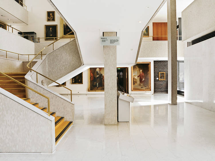
Royal College of Physicians, Euston

What goes on here, then?
In a world where ‘brand ambassador’ and ‘insight wizard’ have become actual job titles, it bears remembering that some people choose to sort out sick people for a living. It takes ages and is incredibly hard work to become a doctor, so it’s just as well they get somewhere nice to study.

Why so pretty?
You can thank architect Denys Lasdun (the man behind the loved/loathed South Bank complex) for the RCP’s bold exterior lines and gleaming, appropriately hospital-like mosaic tile-covered innards. It wouldn’t have been his idea to accent those gold railings with walls full of gold-framed olde worlde portraits, of course, but we’re digging the design decisions that followed the building’s completion in 1964.

Evolution House, Kew

What goes on here, then?
Literally nothing, at the moment – as part of the complex of greenhouses at Kew’s Royal Botanical Gardens, it’s currently in the midst of a massive restoration project, and won’t be in use again until 2018.

Why so pretty?
It’s mostly down to the materials. Though lots of the stuff used to build things was in short supply when Evolution House was erected in 1952 (thanks, war), there was loads of aluminium kicking about, so the Australian government (who gifted it to the director of Kew) went ahead and built the largest aluminium structure of its kind. In return, Kew used it to house Aussie desert plants. Aww.

Advertising

School of Oriental and African Studies, Bloomsbury

What goes on here, then?
Learning, you’d have to assume, mostly of the Oriental and African variety. Could be wrong, though. Might be a clever front for an Ibiza-style super-club. Probably not.

Why so pretty?
It’s another effort from mid-century master Denys Lasdun, and another concrete beast. The school’s library, pictured above, is especially pretty. Inside, Lasdun’s trademark brooding grey panels are offset with flashes of bronze anodised aluminium trim, all of which is illuminated by a grid of pyramid-shaped ceiling lights. Anyone who thinks Brutalism can’t be beautiful ought to pay a visit immediately (just make up some nonsense about being a ‘mature’ student).

Swiss Cottage Central Library

What goes on here, then?
It’s a library, so people putting books on shelves, people using the free internet to look at cat gifs, people arguing about an overdue fee on their copy of the latest Jack Reacher – that sort of thing.

Why so pretty?
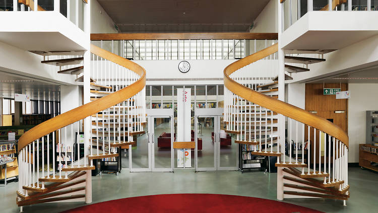
Big fan of symmetry? So was Sir Basil Spence, who finished building NW3’s grade II-listed library in 1964. It was intended to be part of a bigger civic complex, but plans changed when government reorganisation saw the Metropolitan Borough of Hampstead absorbed by the borough of Camden. The building’s exterior is characterised by distinctive vertical concrete fins, but inside it’s all about open spaces and mirror-image features. Phwoar.

Recommended
    You may also like
    You may also like
    Advertising