

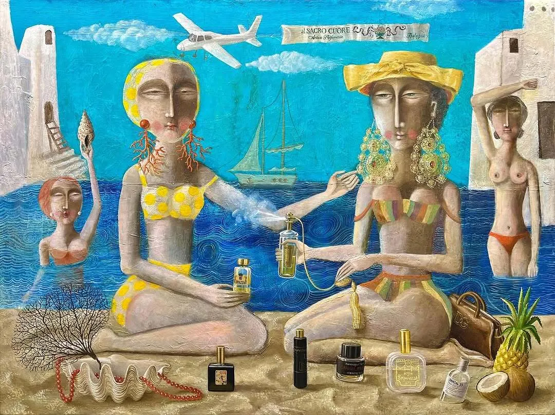
[image]
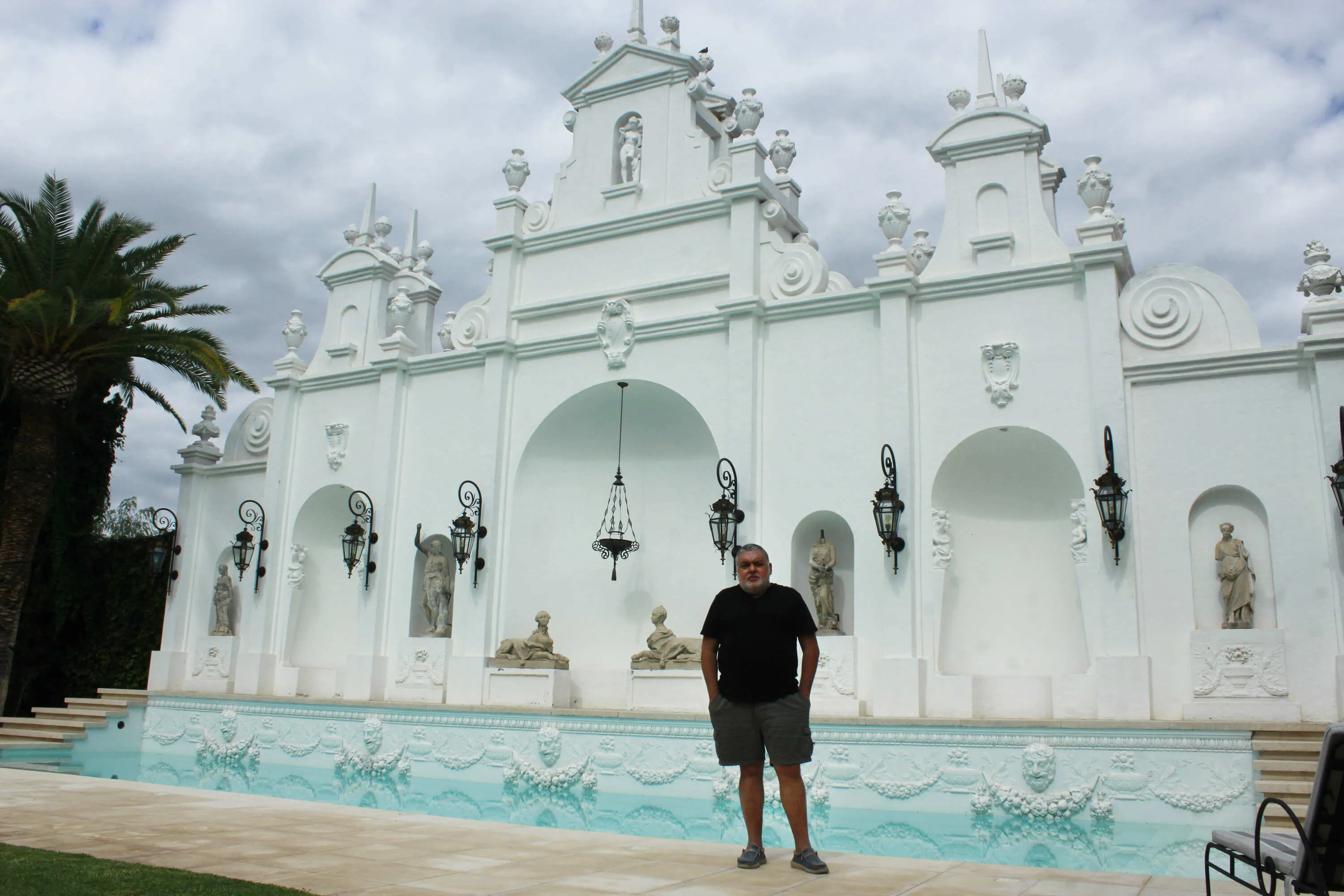
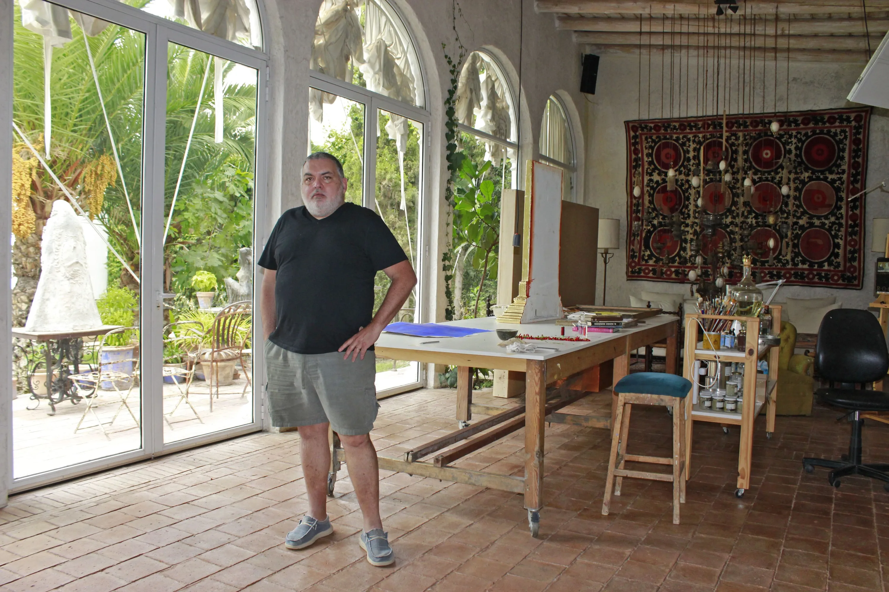
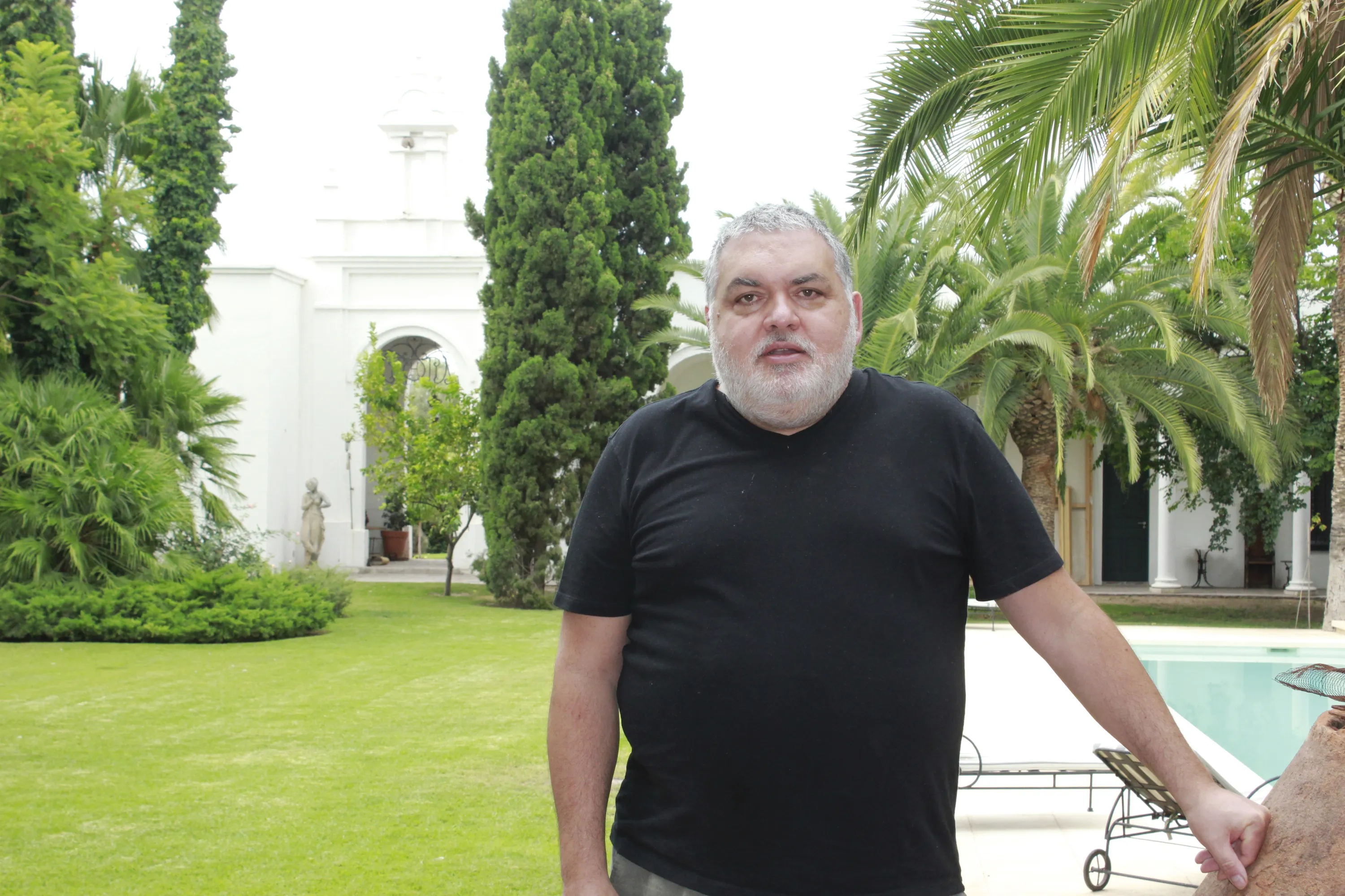
[title]The visual artist Sergio Roggerone lives in a magnificent and striking house, which draws attention for its domes in the rural area of Chachingo (Maipú). La Alboroza, as its name suggests, is the place of happiness. It’s the perfect refuge for Roggerone, who spends most of his time creating his work in his bright atelier. He also alternates his stays in Mendoza with trips that inspire him to reinvent himself.
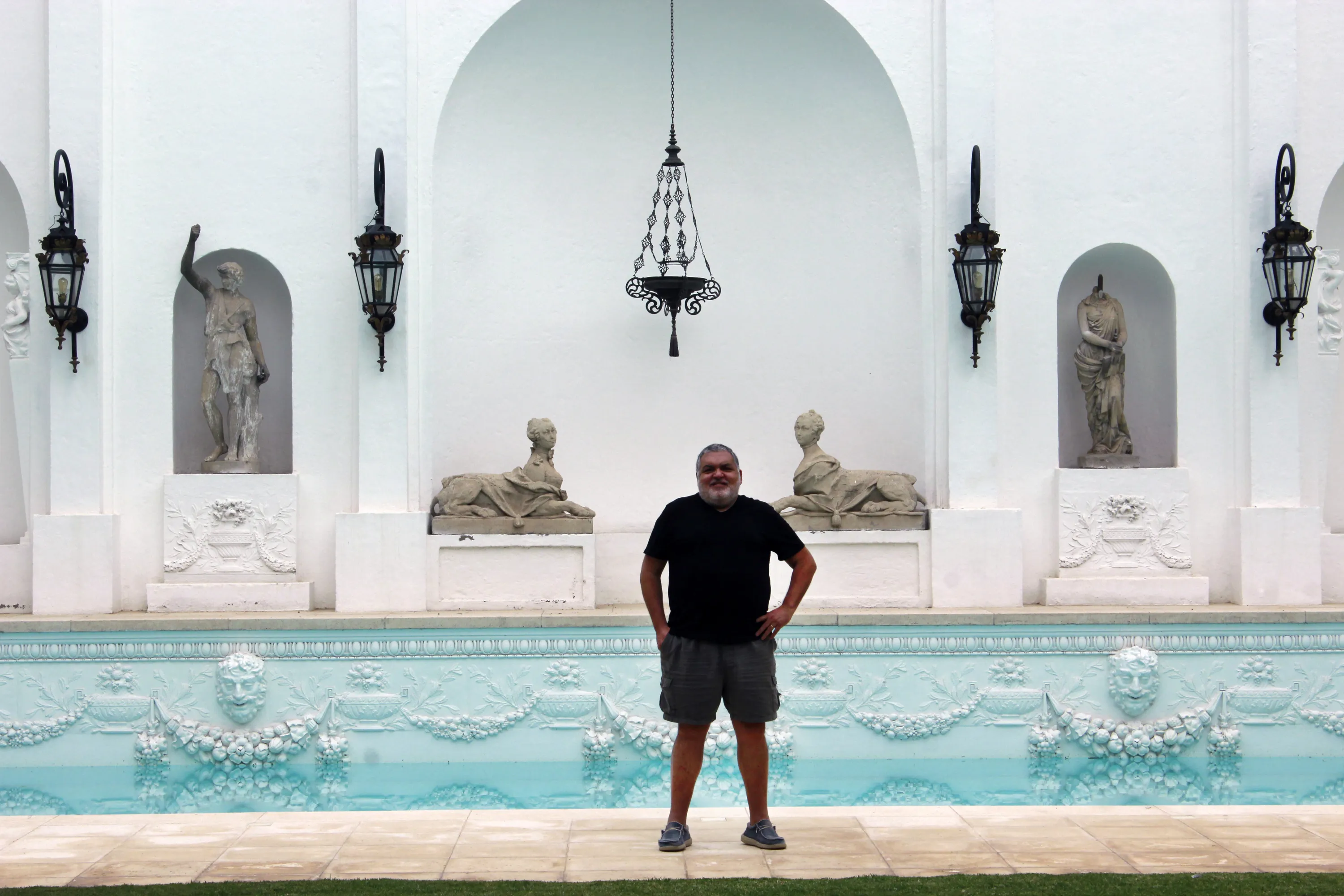
The house itself, designed by Roggerone, is a work of art reflected in Argentine magazines like Casa de Artista and the book Los Excéntricos.
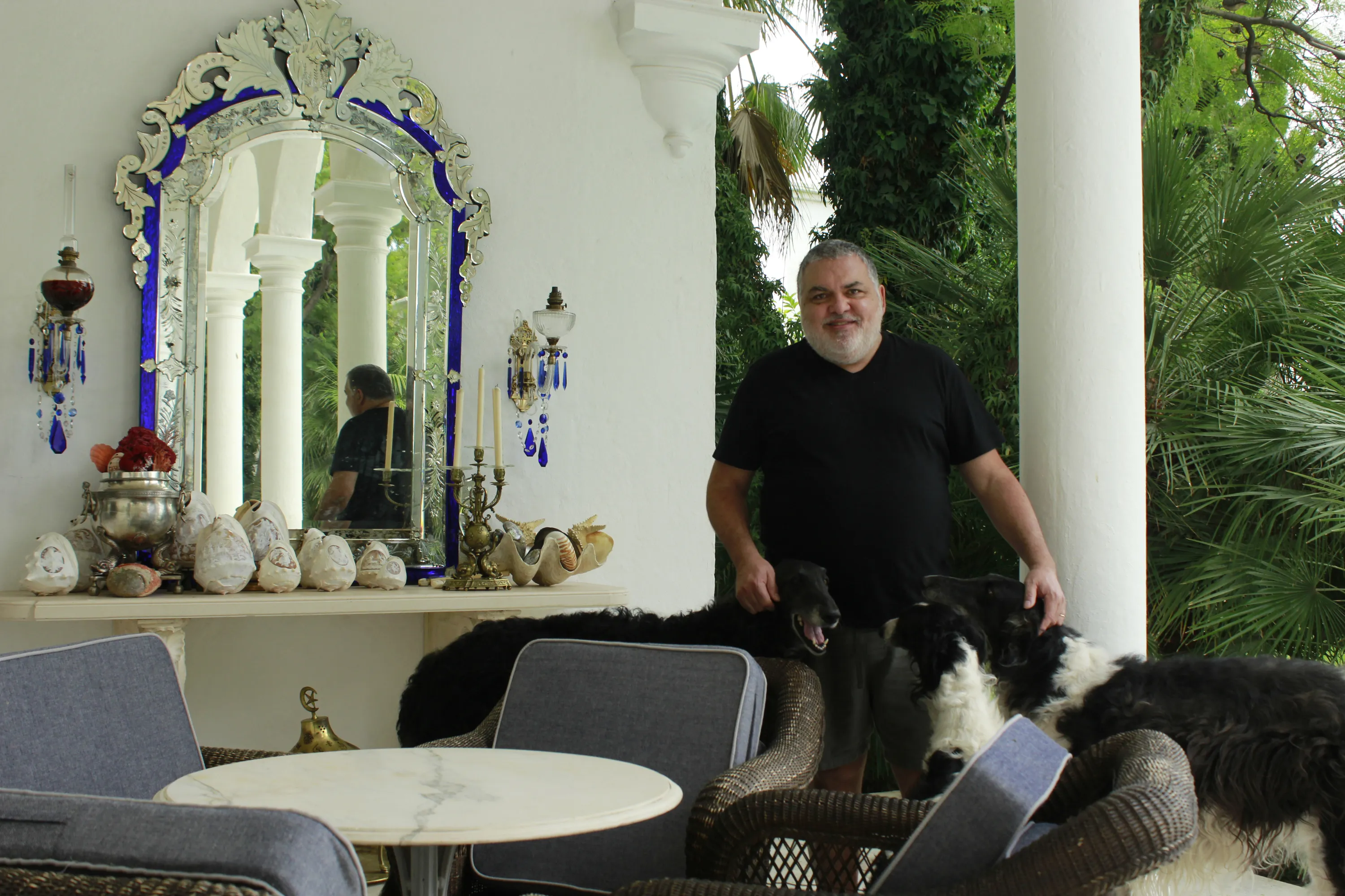
Sergio welcomed us into his home to talk about his career and new creative challenges. “The house is the container, for me it’s the womb, it’s the place where I’m 24/7, meaning I don’t leave here except to go to the airport to catch a flight. I’m always here. The pandemic seemed incredible to me because I realized that I was born in a pandemic. I’ve always been holed up here.”
"I don’t leave my house except to go to the airport to catch a flight"
Your house is called "Felicidad" (Happiness)...
La Alboroza is the place where happiness lives. I’m happy here, I love it. I travel, but at the same time, I always come back because I love Mendoza.
As an interior designer and architect, what would you say a house must have to create that feeling of happiness?
For me, the important thing is the materials, especially noble materials. I say no to porcelain tiles, no to imitations that are essentially plastic. You should use marble, and if it gets stained, let it stain. And let the passage of time show on the marble, let the stain from the lemon you left or the vinegar you spilled show, let the passage of your life through that place be evident. It’s the same as wrinkles, you get older and are wrinkled. People get Botox to hide the passage of time. But it’s not that you don’t look old; you’re old. The house is the same, they make something appear that it’s not. I think interior design doesn’t matter to anyone, people live in shoe boxes.
I’d like you to talk about your use of color, which is something special for you, and there’s a change in palette in your recent works…
The use of color is incredible. That’s why color is so difficult, right? It’s been a recurring theme in my work because it’s one of the hardest things to handle. And yes, I could say I’m refining color with the age I have, and because the older you get as a painter, the better you adjust details. I’m moving away from total figuration and heading toward abstract figuration, which is more material.
"The older you get as a painter, the better you adjust details"

It’s an oil technique. I mix oil with cold wax and with silica sand, which is like a kind of ground glass or quartz powder. This gives more substance to the oil paint, and yes, I’m trying to use other color ranges.
And does this materiality affect the color?
The mix of all these materials acts like a mirror. So, when you put the pigment on top of that mixture, the color comes out with much more strength, it looks much more powerful, brighter. You see the pure color, so to speak.
If you could define the stages of your life in colors, how would they be?
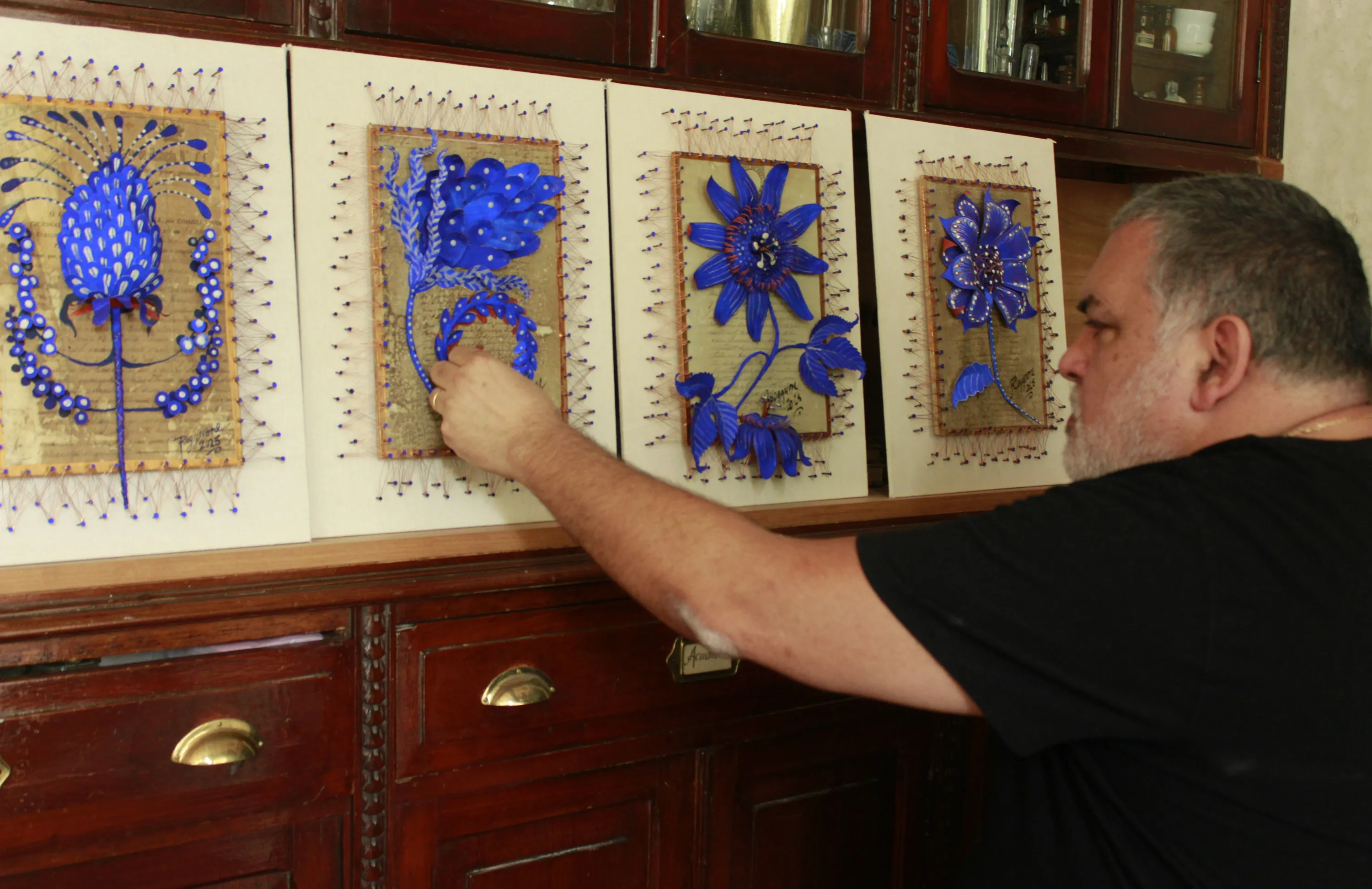
Recently I painted a piece all in shades of green, another one in yellows, and then I did one in browns. And now that I’m older, I use a lot of cobalt blue. You have to be very subtle with color; it can beautify a work or ruin it. The same goes for a house or an interior space.
"You have to be very subtle with color, it can beautify a work or ruin it"
But you’ve always liked cobalt blue; your patio is blue...
Yes, and now I’m doing a series of 18 flowers that a friend asked me to paint with a blue that has a chemical particularity. On my last trip to Italy, I found a shop in a little street that had cans of casein, a milk-based protein that’s almost impossible to find and that works as a pigment binder. I used it in the cobalt blue of the flowers, which become luminescent in the dark. Balto, a painter I love, used to work with it.
It’s a whole world, color…
You have to study it, and it’s very long because it comes from Ancient Rome, from the Greeks. But the one who restructured all the colors was an artist named Albert Munsell; he was a genius, he created the color circles, tonal values, and redefined the whole world of color. Munsell was a genius. You need to have that sensitivity to be able to combine one color with another, like a musician when they put one note next to another, it either sounds good or it sounds terrible. I also learned a lot about color use from Maga Correas (an interior designer and decorator from Mendoza, sister of artist Nora Correas). Maga was very much into color. You’d go to a house decorated by Maga, and you’d find a color she loved to use called lacre (lacquer). It came directly from a can called rust converter. It was used to remove rust from metal. Maga would paint the walls with it.
In photography, black and white has a lot of power. What happens in visual art?
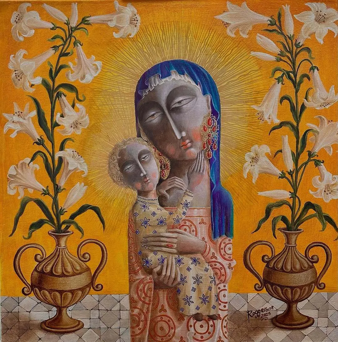
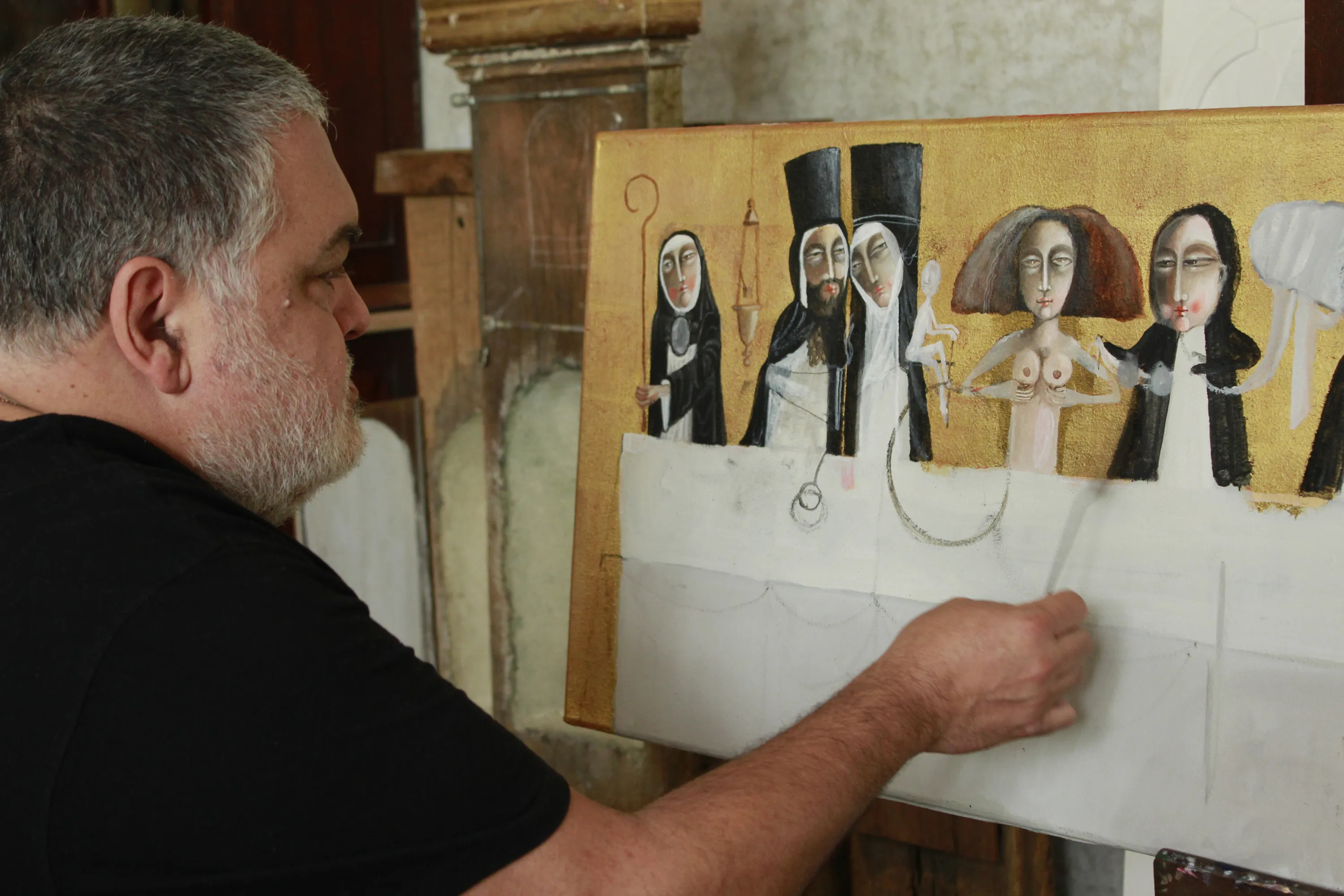
Sure, white is the presence of all colors, and black is the absence, exactly. I’m painting a black-and-white piece right now. El Gran Guiñol II. But well, you always have skin color and gold, though I’m fully into black and white, which is the stripping of everything and is elegant.
When I was 20, I met some antique dealers, friends of Maga, who also passed away. These guys had a 16th-century Jesuit cloister in La Manzana de las Luces in Córdoba. For Maga, they were the interior designers with the best taste in all of Argentina; they made a fortune. After Maga died, I visited them in Córdoba and asked them: What’s the difference between you and Maga? Why do you paint everything white, and Maga was so into color?
Then they answered me: Do you know why Maga used so much color? It’s a topic we always discussed, and the answer is because the wine merchant generally doesn’t buy good objects. She didn’t have paintings or valuable furniture to decorate with, so she used color, colored curtains to enhance the spaces. She had to elevate houses that had nothing. We, on the other hand, are antique dealers, and in order for the antiques to look good, we paint everything white. That answer blew my mind, and I thought it was very accurate.
And the gold leaf, something so characteristic in your work, are you moving away from it?
Quite the opposite, I use it more and more. I went to Mexico to take a course with a church gilder. I’d also worked with gold leaf with Maga, but with real gold. It was very hard to find the materials for it in Argentina because to use gold, you need to put a material underneath called bol de Armenia, which is a type of clay. After that, you burnish it with agate stone, which makes the particles of that clay face the same way, so the gold looks like a mirror, it’s bright, impressive. The Egyptians invented this technique thousands of years ago. Then it became very popular during the Renaissance in Italy, and also in the Russian Orthodox Church, among the Copts, and the Greeks.
Some of your latest paintings are a bit Picasso-like, are you leaving figurative art behind?
As I said before, I’m moving toward abstract figuration because to reach abstract art, you first have to master figuration very well. One always has new searches, and if you always do the same thing, you get bored. It’s a personal challenge. They say that artists paint only one work throughout their lives. And that work mutates, replicates, repeats in thousands of ways, but it’s always the same painting, in different situations. The only one who broke away from this was Picasso. Cubism came from that search.
"To reach abstract art, you first have to master figuration very well"
Artists like Fader or more contemporary ones like Julio Le Parc highlight the light of Mendoza. Does it influence your work? I travel a lot, and I can say that the light in Mendoza is wonderful, it’s brilliant. I always come back because I love this place.