

[image]
[title]Tite Barbuzza's current state is linked to challenges that defy categorization. Her essence, creativity, and approach to work are more about opening up to new projects than staying within the familiar. Tite was born in Mendoza, studied graphic design at UNCuyo - the National University of Cuyo - and lived in other worlds, other times: when fulfilling dreams was a difficult and unknown mission. However, her curiosity and adventurous spirit led her down paths she treasures as jewels.
She lived in Buenos Aires, Los Angeles, Barcelona, and Mendoza, where she returned after much traveling. She believes that design is more than a profession; it's a way of thinking and a parallel point of view that must be both functional and aesthetic. In the 1980s, Tite created album covers that are now part of the collective unconscious, working with bands like Soda Stereo, Enanitos Verdes, and David Lebón. Years later, she was a designer for the European music and arts festival, Sónar.
The scope of her work is vast and distinguished: from record companies and management agencies to editorial projects and fashion magazines, from wines to sounds, Tite has always had an image to contribute. In this interview, we discover more about a design artist who never stops.
What are you currently working on?
I just finished the cover of the book "Aún queda por decir", self-published by the literature workshop I'm part of, where I'll be publishing a short story. For the past two years, I've been writing fiction, in addition to blogging about design. I'm also planning the edition of an art book, specifically about my sister Isabel, a sculptor with a long career and a powerful body of work. This is both a pleasure and another challenge.
What do you consider the most significant milestones in your extensive professional journey?
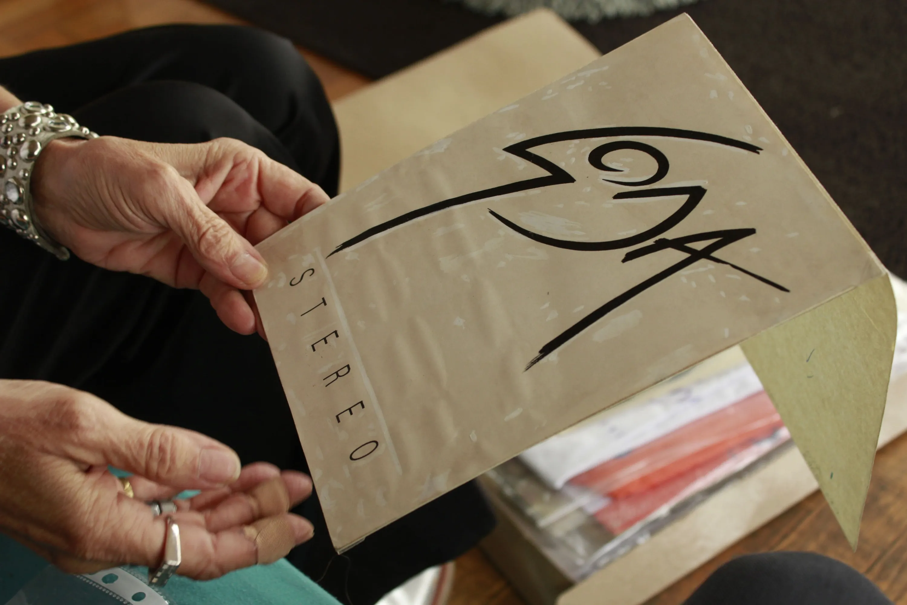
The late 80s in Buenos Aires were, without a doubt, an immensely gratifying way to start my professional career as a designer. The city was on fire, and I wasn't afraid of anything. There was a convergence of creative people determined to change things, and a real, even magical, synergy. The soundtrack of that era is the one I collaborated on in various projects, with the logo for "Doble Vida" by Soda Stereo being, without a doubt, the most well-known of my works. That was my second cover. The first was "Habitaciones Extrañas" by Los Enanitos Verdes. I also designed "Primera Sangre" by GIT, and I have very fond memories of the cover for Fricción’s "Para Terminar".
"The late 80s in Buenos Aires were, without a doubt, an immensely gratifying way to start my professional career as a designer"
In reality, I have very vivid and cherished memories of all my work. I recently sorted through the archive of my entire career, and it was lovely to revisit so many projects, so many teams, people, exhibitions, concerts... It all ended with hyperinflation. I graduated and moved to Los Angeles for two years, which changed my life once again. I worked in Hispanic television as a producer and screenwriter. Then came a long journey that led to Spain. The 12 years I lived in Barcelona were also a clear milestone in my path. There, I was part of the design team for Sónar, the quintessential European electronic festival, during three editions: 1996, 1997, and 1998.
How did you navigate the technological advances throughout your career?
My interest in editorial work and books led me to write as a co-editor for a section on music, videos, and technological gadgets for the design, fashion, and architecture magazine B-Guided. In 1999, I edited the book BCF, Barcelona Club Flyers, a visual journey through the communication of the so-called "club culture," where electronics set new trends, for Actar, a well-known Catalan publisher of architecture, photography, and design. These were the early steps of design with personal computers and super creative new programs. It was a turning point.
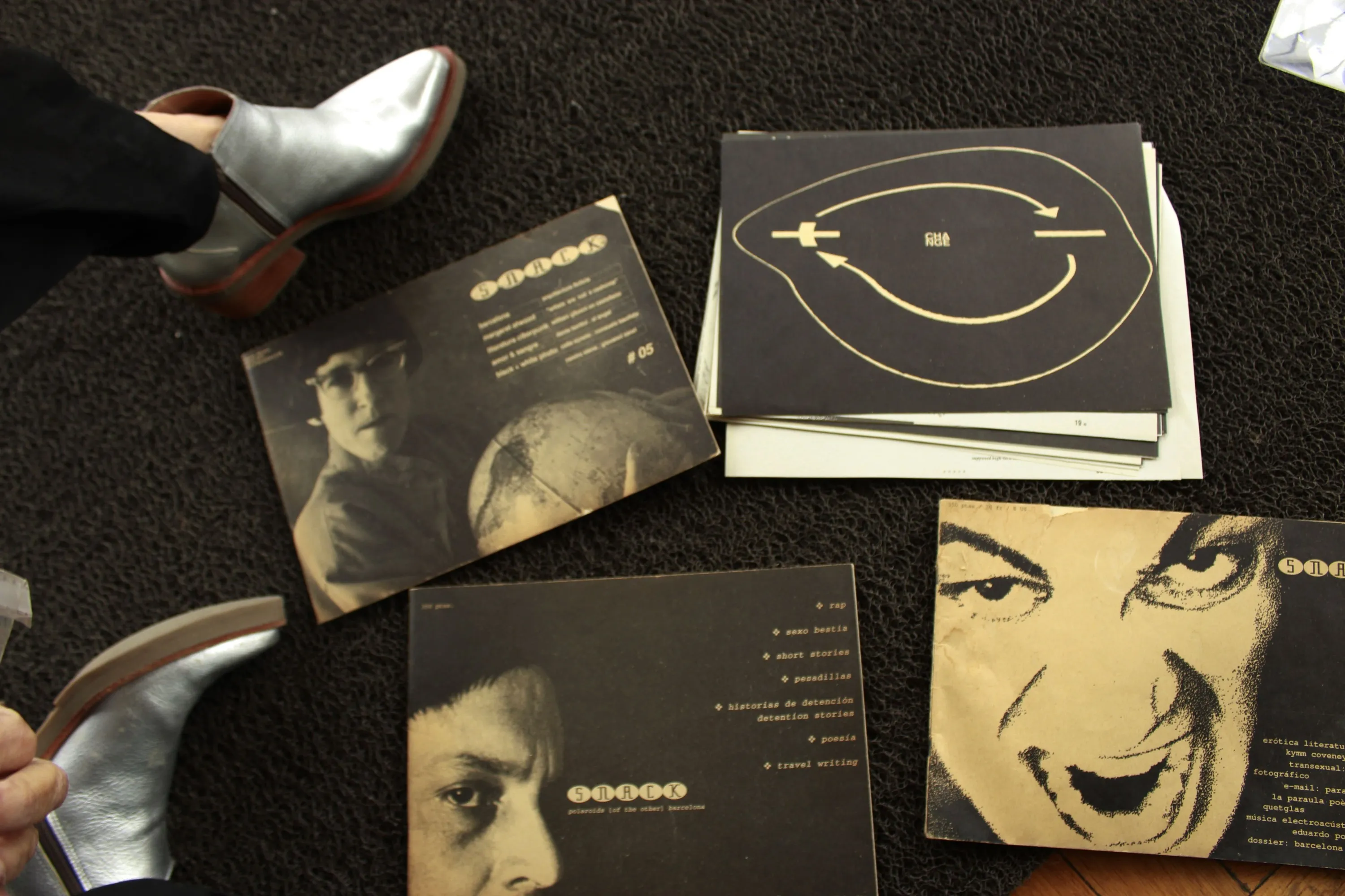
It's very exciting to have been part of this movement during that particular time in Barcelona. Also, with a group of diverse people from different parts of the world drawn to the thriving post-Olympic 1992 Barcelona, we were stranded in the city. A total crisis after the Olympic Games. There was no work; design studios were downsizing; everything was quite chaotic, an ideal breeding ground for a potent and disruptive underground scene. During that time, we published a fanzine with a multinational group, a "suicidal" magazine, as they were called in Spain, because their end was inevitable. Even so, we published five issues in the two years the project lasted. It was called SNACK, a multilingual magazine. Today, those five editions are part of the permanent collection of the Barcelona Design Museum.
And after shining around the world, one day she returned to the province where she was born.
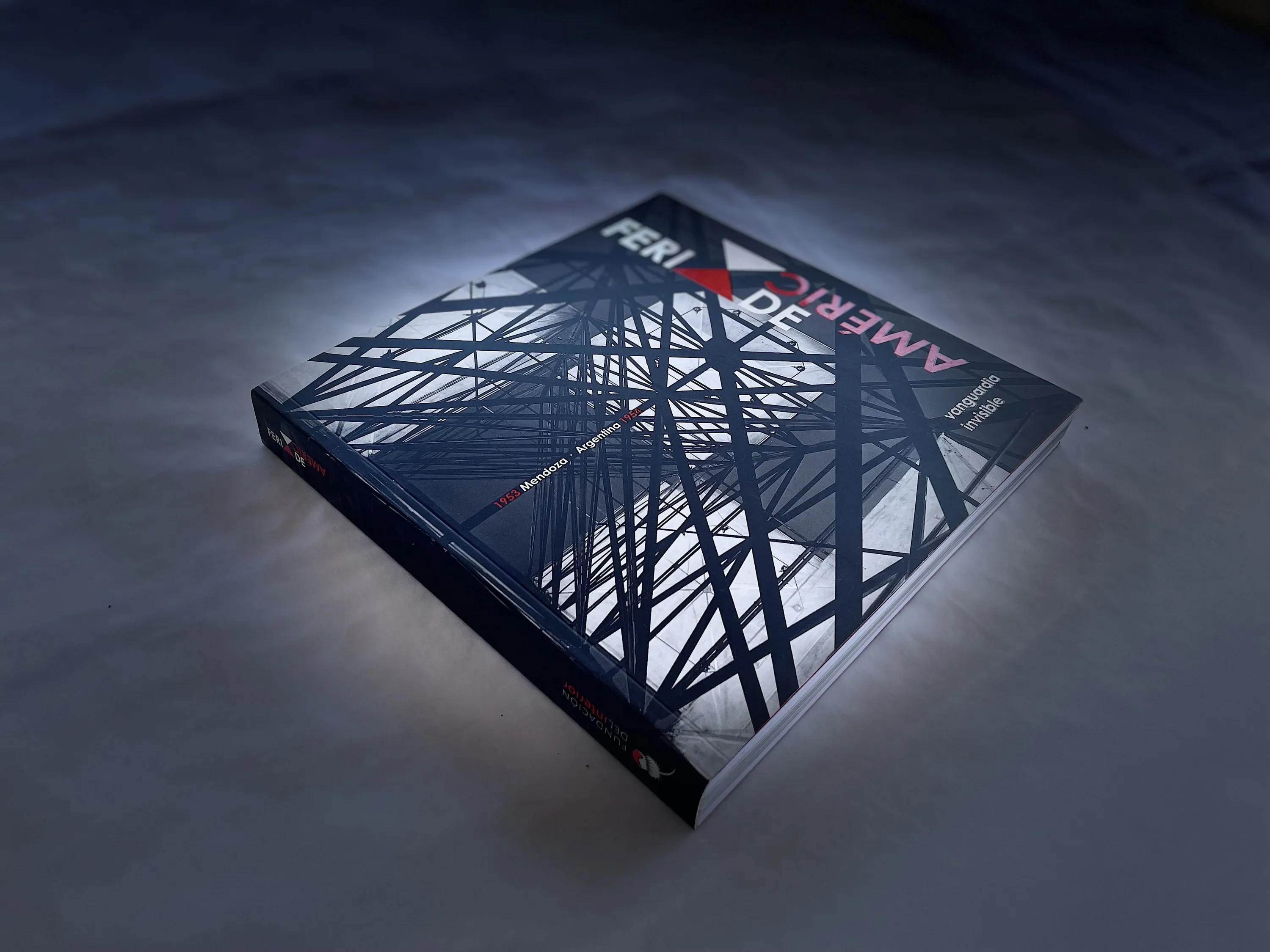
Tite Barbuzza says that her return to Mendoza "once again changed everything." In her home province, she soon became involved in a vineyard and organic wine project from scratch. To such an extent that the promotional image for that product, MTB, was a finalist at the Ibero-American Design Biennial in Spain. At the same time, she collaborated on art and design projects, such as those for ED Contemporáneo and Fundación del Interior. She designed the cover for C/Temp, a book on contemporary art from Mendoza, and researched, coordinated, and designed the book Feria de América, vanguardia invisible, which documents an unprecedented event in Mendoza in 1954.
A particularly cherished experience for this outstanding designer occurred in 2010, when she was invited by the Centro Cultural de España in Buenos Aires to develop the concept and design for a campaign on gender and transgender equality. "The idea was to challenge the viewer, with the victim becoming the victimizer, in a double rhetorical play." For Tite, each project is a milestone, and her latest album cover works also represent this: Mavi Díaz y las Folkies or El Gonzo, both nominated in the Cover Art category of the Gardel Awards, or Gondwana, among others.
Where does your interest in music come from?
I come from a family of music lovers. One of my earliest memories is listening to "The Four Seasons" by Vivaldi in an old apartment; I must have been 4 or 5 years old. Later, as I grew older, The Beatles coexisted with Joan Manuel Serrat and Elton John. And one day... my father came home with "The Dark Side of the Moon" by Pink Floyd, and without a doubt, that was one of the best moments of my life. One thing led to another until I chose to work on the image of music for my university thesis.
"I come from a family of music lovers"
And what is the process like when working with music artists?
The process always involves delving deeply into the ideas the artist has about their work. From there, we begin working together to define styles, references, seeing what works and what doesn’t, which helps with thinking. The result must stand out for its semantics, understood as transcending the meaning of the signs and their combinations. I remember when I started, and MTV didn’t exist yet, I read this phrase: "Music is no longer just heard; it is seen, and it must be made to be seen."