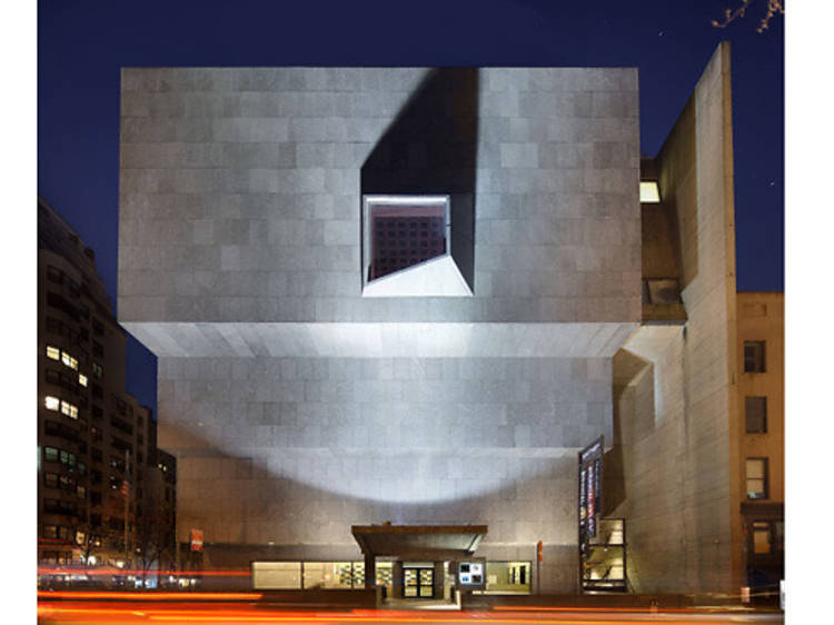
RECOMMENDED: Full guide to the Whitney Museum in NYC
Right off the bat, the 2014 Whitney Biennial raises a question: Is it an exercise in out-of-the box thinking? Or does it represent a tacit admission that the Whitney is no longer institutionally capable of mounting its signature show? The answer is probably both. Read on for our full review of this year's museum-wide exhibition with our own slideshow gallery of highlights, then scroll down for a sneak peak of the gallery itself.
Instead of the usual buildingwide bacchanalia of zeitgeisty goodness we’ve come to know and love (or love to hate), the proceedings are broken into three more or less discrete exhibitions. Each is mostly confined to its own floor, and organized by a different outside curator. Handling the duties are Stuart Comer, chief curator of media and performance art at MoMA; Anthony Elms, associate curator at the Institute of Contemporary Art, Philadelphia; and Michelle Grabner, who is an artist and professor in the painting and drawing department at the School of the Art Institute, Chicago. Asking why they got the job as opposed to other people is a bit like wondering why certain Ping-Pong balls pop up during Lotto drawings.
In some cases, one curator’s selection winds up on the floor of another (or in a Whitney common area, such as its lobby or moat), but each floor remains distinctly the expression of a single point of view.
Somehow it works, or at least it does so enough of the time to make this Biennial seem better than most. I know: faint praise! Still, this edition should be remembered for its inclusion of paintings in pretty decent numbers, as well as its emphasis on semiforgotten careers and artists from outside New York.
This separate-floor arrangement, of course, makes it easier to heap praise or to assign blame, depending on your tastes. For me, the Westminster trophy for Best in Show indubitably goes to fourth floor, helmed by Grabner. Apparently the first practicing artist involved in shaping a Biennial, she brings an artistic eye to installing art, a talent that curators were routinely expected to apply before the practice became professionalized. In her own work, she’s something of a formalist—a dirty word in certain quarters—but the attention she pays to the relationships between forms turns out to be a virtue.
Many of her selections are worth a shout-out, but those off the top of my head includes Gretchen Bender’s black crumpled cenotaph, listing backlighted movie titles form the ’80s; Joel Otterson’s psychedelic harem tent; Amy Sillman’s prismatic abstractions; and Joshua Mosley’s charming Claymation video of an early-20th-century tennis match. The last is hung within a stretch of rooms putting an emphasis on quietude, both visually and conceptually. It starts with one of Anthony Elms’s picks: Zoe Leonard’s spooky and sublime camera obscura installation. Set within a spacious portion of the floor, the piece consists of a large lens board covering one of the Whitney’s “eyebrow” windows overlooking Madison Avenue. On the opposite wall, the lens throws an upside-down projection of the buildings across the street, with the dimmed, blurry image being pretty much the same scale as its subject. From there you proceed into the gallery containing the aforementioned video, along with Stephen Berens’s layered photos of Rome, and a long shelf filled with Shio Kusaka’s exquisite pottery. This part of the exhibit is best summed up by the title of Ben Kinmont’s text-driven tableau in the next room: Shh. Down the corridor you’ll also find Jennifer Bornstein’s video of naked women performing modern dance routines, and Peter Schuyff’s case full of corkscrewing pencils.
I wish I could say the rest of Biennial was as strong as the fourth floor, but it isn’t. I liked Ken Okiishi’s painted flatscreens on floor three, along with Bjarne Melgaard’s crazy, hypersexualized whorehouse of horrors off to the left of Okiishi’s wall. Melgaard is precisely the sort of art star who’s benefited from the market’s premium on sensationalism, but give the man his due: He’s good at what he does.
Ultimately, the 2014 Biennial is somewhat square, even provincial, and that may be okay for now. Because truthfully, the formula is impervious to change. You could scour the planet and probably find enough artists to mount a truly mind-blowing survey every other year. But that supposes the Biennial is just a show when it’s really not. It’s a brand, and like any brand, genuine risk makes its shareholders nervous. The Whitney’s forthcoming MePa home will only raise the stakes in this sense, making a ground-up rethink less likely.
Nobody calls the Biennial the Oscars of the art world anymore, but in some ways, the comparison is more apt than ever. Like the Oscars, the Biennial is an exercise in self-love, demanding attention it doesn’t quite deserve, but you pay it heed anyway. On that score, 2014 is the Ellen DeGeneres edition: safe, genial, with just enough jokes that land to distract you from the ones that fall flat.


