40. Pet Shop Boys ‘Very’

One nice thing about CDs was that the hard plastic format allowed designers to experiment with molds and textures, like this studded, hazmat-like case from the always image conscious Pet Shop Boys.
The advent of Photoshop, the rise of indie labels and massive influxes of cash meant that records in the 1990s started to come with more creative art and packaging. Unfortunately, with the CD being the dominant format, most of saw these great albums covers at palm-sized five inches wide, unlike the wide vinyl sleeves of the 1970s and those 12-inch '80s song singles. Still, graphic design in the '90s was the new rock & roll, with art collectives like Stylorouge, the Designers Republic, and Pen & Pixel considered as cool and popular as music acts.
These best album covers of the '90s paid homage to classic rock and jazz, pushed hip-hop music into high art, and looked to the future.
One nice thing about CDs was that the hard plastic format allowed designers to experiment with molds and textures, like this studded, hazmat-like case from the always image conscious Pet Shop Boys.
This druggy masterpiece came packaged like medicine, with the CD sealed like a giant pill under foil inside a plastic bubble.
Perhaps an example of so-bad-it’s-good, this charmingly dopey cover shows just how much hip-hop has changed from its psychedelic, brainy heyday in the early ’90s. You don't get a lot of candy-colored physics references these days.
If you had to boil goth down into a postage stamp, it would look like this. It’s dark, simple, structured and gorgeous, just like the music inside.
Sheffield collective the Designers Republic translated the shockingly new, fractured sound of Warp Records’ manic electronic music into images. Their style became so zeitgeisty, it was turned into a dazzling PlayStation video game, Wipeout. This Autechre sleeve sums up their aesthetic perfectly.
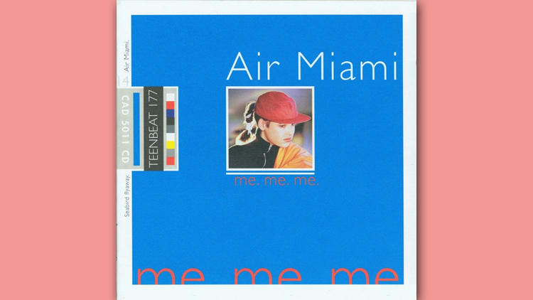
Any talk of ’90s music design would be remiss without Mark Robinson. Best known for fronting Unrest and running Teen Beat Records, the D.C.-area indie icon was a designer’s designer, referencing Pantone cards and printers’ guides in his clean, bright works. His giddy Air Miami project nails it.
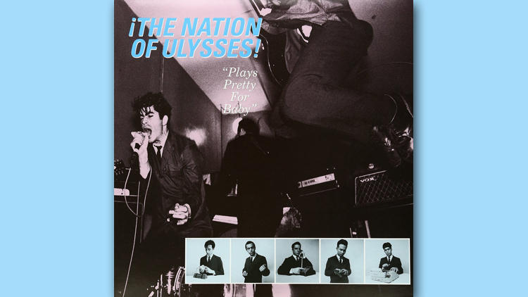
Dressed like French leftist spies, Nation of Ulysses were not your older brother's punk band. But the kinetic image of them playing on this cover made you want to see them immediately. Singer Ian Svenonius became an underground fashion icon immediately.
R.E.M.’s longtime designer Chris Bilheimer had many peaks in the ’90s. Automatic featured an Anton Corbijn image of a sign atop the Sinbad Hotel in Miami, and oozed nostalgia and science, perfect for children of the ’50s facing middle age.
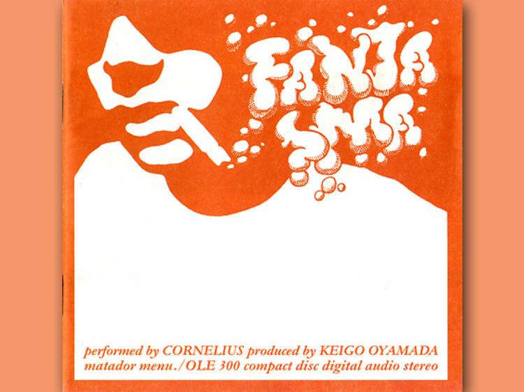
The Japanese oddball’s cut-and-paste trip was perfectly embodied by this popping print—it looks like candy jazz.
A clever shot appears to be a body spontaneously combusting. Jim O’Rourke, one of the two key players in this Chicago post-rock band, would go on to feature many provocative images on his albums.
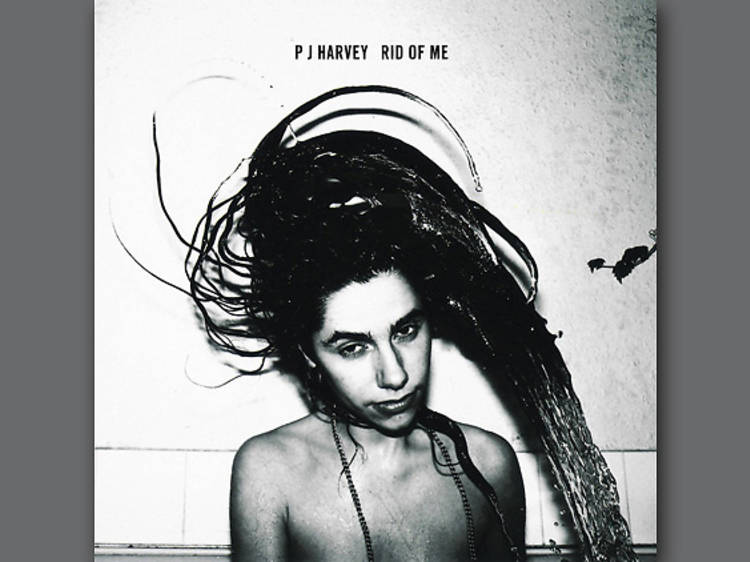
Harvey did the whole whip my hair thing long before Willow Smith.
The influential, progressive punk band pushed the genre forward by paying homage to the 1950s. Well, in the art. The music was sci-fi hardcore.
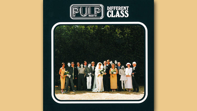
Jarvis Cocker’s Britpop classic showed cardboard cutouts of the band in everyday settings. They were facsimiles of rock stars butting into your mundane family photos, as Pulp were no longer “Common People.” Every Britpop band was a brand with its trademarked logo.
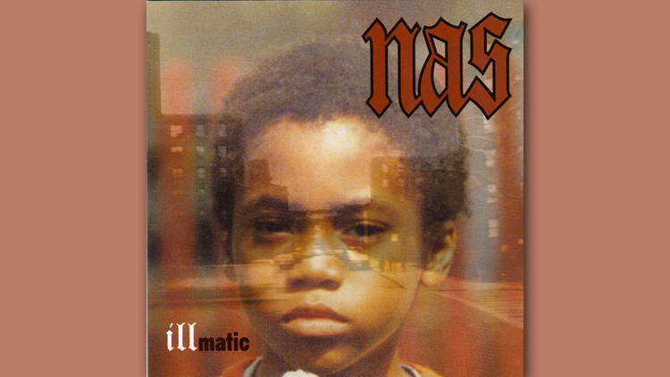
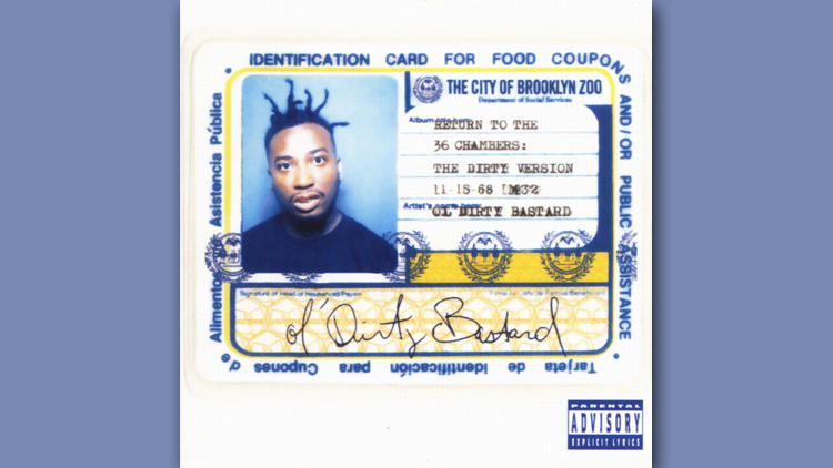
One of the most iconic rap covers ever, this technique of showing the MC at a young age has been copied countless times since, sometimes by Nas himself.
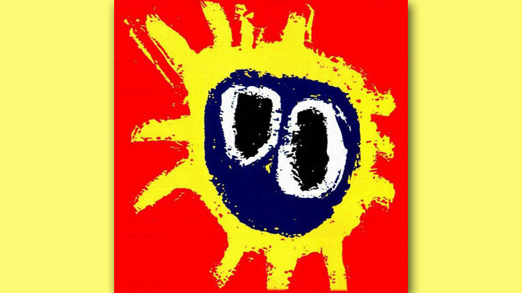
So that’s what being on ecstasy looks like.
The chemical hazard warning was appropriate for a band that ignited an entire scene: Bristol trip-hop.
The image unfolded to show Ms. Jackson, being her nasty self, standing topless, with a man’s hands cupping her breasts. It’s been referenced dozens of times since (see Ciara’s 2015 album) and has become the Birth of Venus for R&B.
We dig the way “THE ROOTS” sits cut off on the upper right. As if the harrowing picture and title didn’t give it away, this homage to Blue Note jazz sleeves underlined that under the veil of tidy society, shit is just off.
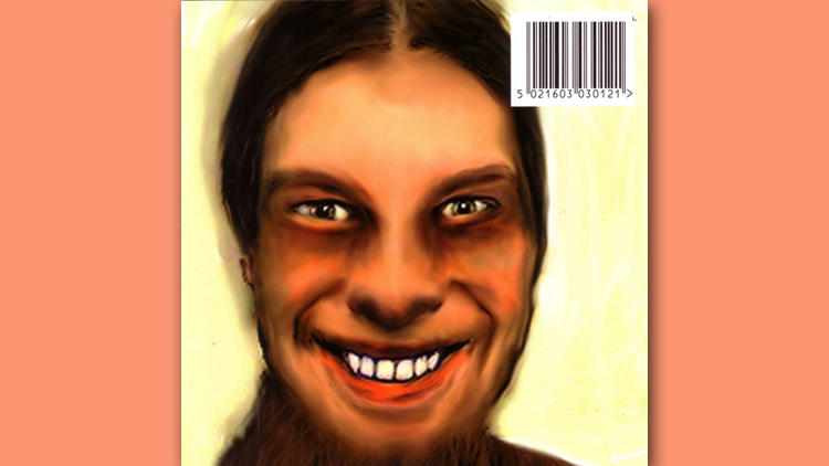
Though his music could have been mistaken as the product of artificial intelligence, Richard D. James made his work identifiably autobiographical by slapping his unsettling grin on most albums.
We would see this movie a million times.
These washing machine shirts were sold on the band’s 1995 tour and sold like hotcakes. Pretty brilliant marketing from a bunch of art punks.
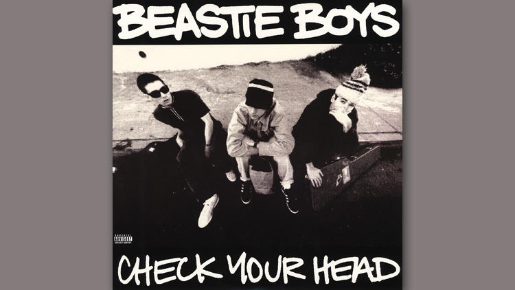
Documenter of the skate and hardcore scenes, Glen E. Friedman shot this image of the trio. There was an urban legend amon fans that they were posing in the shape of the Adidas logo. Some call back to Run DMC or something, I guess? But the instrument cases was the sign that '80s rap was dead.
Emo in a nutsell.
A replica of the Kinks’ Kontroversy, Dig Me Out jumped off the record-store shelves to those who knew their rock history. It shouted, This is the new classic rock.
Androgyny and glam go hand in hand. When this earth-shaking English album came out at the height of grunge, it was like glitter at the end of a dark, dank tunnel. This single image announced a sexier, more luxurious alternative to American guitar bands.
Pink, distorted, pretty. No album cover better captures the sound inside.
Shot in the photo booth inside Rainbo Club, Phair’s debut likewise was all about vamping it up in private.
This was the Ramones Ramones for comic-book geeks.
Will Oldham snapped this pic in an abandoned Kentucky quarry.
The subtley horrifying image suited music that sounded like eerie educational film soundtracks. If we had to be nitpicky, though, we’d lose that text in that font.
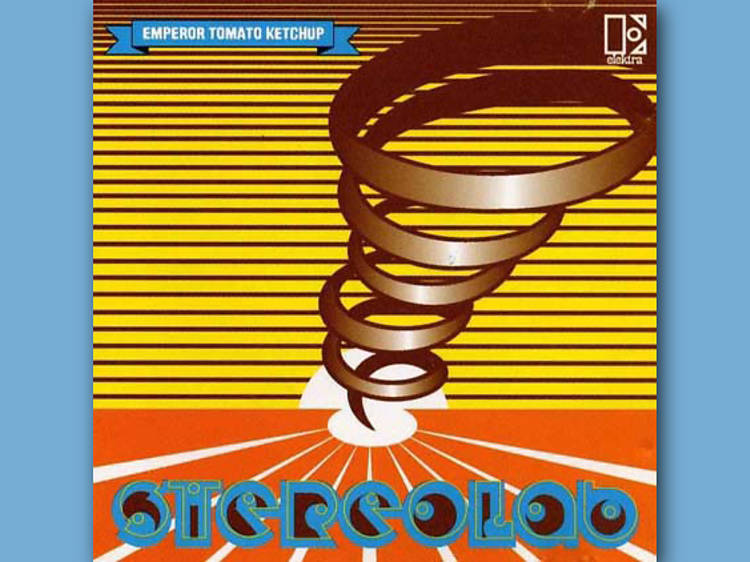
So intentionally gaudy, this wonderful Stereolab release looked like nothing else at the time, just as the group was like nothing else. Now they knew how to make a cool font.
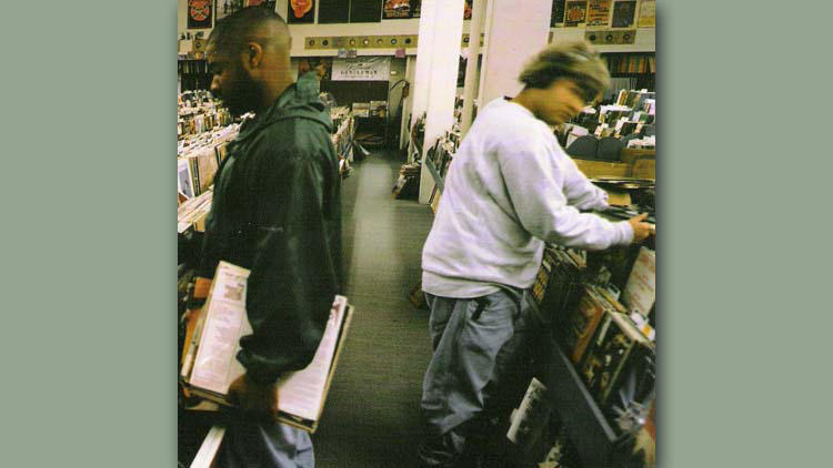
Vinyl is sold at Barnes & Noble now. In the ’90s, however, it had regressed to a cult obscurity. This image seems commonplace in 2015, but back then it was a peek into an entire subculture.
The baby has become so iconic we often overlook how amateurishly on-the-nose the message is. Still, the colors are awesome, and putting a penis in public is punk rock.
Spin magazine ranked this album above Nevermind in its 1991 year-end poll, and we are the minority who agrees. The album cover is better, too. Kurt Cobain would have done the same cheeky nob to selling out for In Utero had the Fannies not beaten him to it.
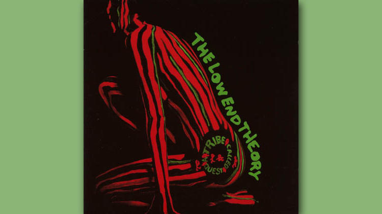
Tribe wasn’t paying tribute to jazz, it was jazz. This sexy album cover was as cool as Miles Davis.
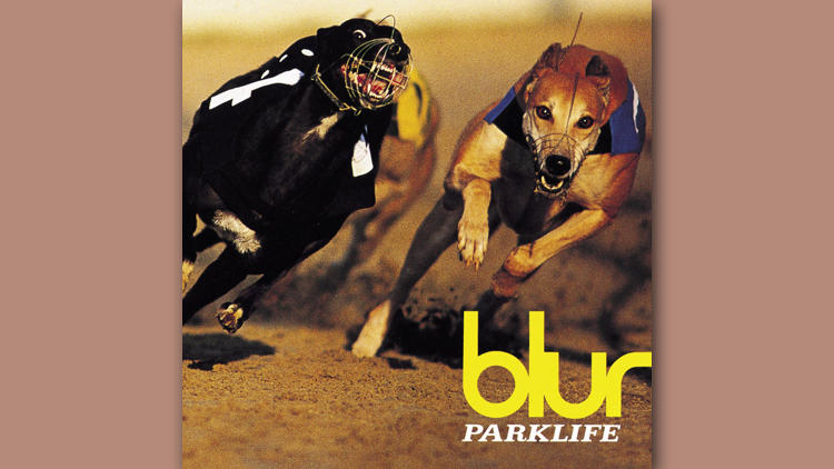
Stylorouge made every Blur album cover a pop art museum piece, digging through fashion magazines for clip art that kept the mood wisely cynical in the face of Britpop’s glossy excess.
Honestly, we could have chosen any Björk sleeve, from the innocent Debut to the kaleidoscopic Post. But it’s Homogenic that best captures the cosmic beauty of her music. George Lucas had to be staring at this when he wrote Queen Amidala, right?
A riff on cigar wrappers, this stately portrait sort of resembled money, too, which is fitting, as Dre has been essentially printing it ever since.
No, wait, this is what being on ecstasy looks like.
Dammit, the world is just not the same without Big Baby Jesus.
The sexiest decade? The 1970s, which produced 13 entries on our list. The era certainly gave us the most full frontal. And you will believe Barbra Streisand can be sexy. Oh, by the way, NSFW warning.
Discover Time Out original video