Seven mesmerising old maps of London

From one woman's A-Z adventure to a life-saving map of Soho, let us guide you around with these beautiful plans of our city

Advertising

Explore the globe, take a trip to outer space, time-travel through history, and then find your way back to your coffee table with Phaidon's 'Map: Exploring the World' (£39.95). Arranged in thought-provoking pairs, this collection of more than 300 maps compares the different ways that cartographers have tried to make sense of the world around us. From an ancient Chinese astrology chart to the moon-map used to land Apollo 11, this celebration of cartography is about much more than getting from A to B. Some more esoteric examples include a representation of London’s cholera epidemic to an early infographic of Mount Vesuvius’s lava flow. You’ll never look at Google Maps in the same way again. 

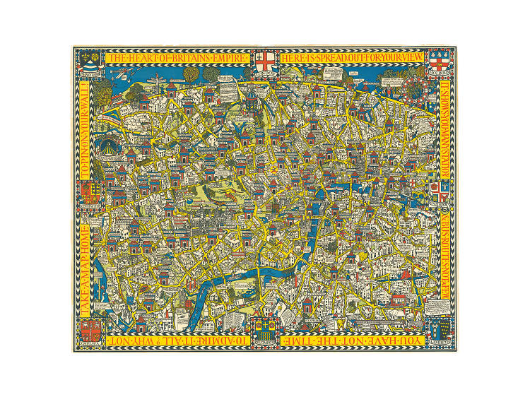
1. The Wonderground Map of London Town, 1914

Before the tube map that we know and love was born (see slide six), The Underground Electric Railways Company Ltd. commissioned this cartoon to convince us all that the underground wasn't grubby and overcrowded - which it definitely was. With a cheery focus on the stations and a touch of 'Where's Wally?' magic, it features cameos from a Hyde Park swan asking 'where's my fountain pen?' and a gent in Clapham questioning: 'what scale is this map?’. Who knows Geoffrey, who knows. 

The Wonderground Map of London Town, 1914, MacDonald Gill

See the full-size map here

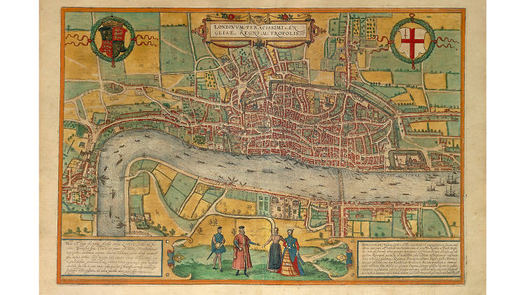
2. Illustrated Map of London, 1575

This map is old. Like really old. In fact it's the earliest existing plan of our fair city. The map was included in the Tudors' big, fat Civitates Orbis Terrarum, which was basically the first systematic town atlas that anyone had tried to make. They did a pretty good job too - although those four giants roaming around on South Bank look pretty scary.

Illustrated Map of London, 1575, Georg Braun and Frans Hogenberg

See the full-size map here
Advertising

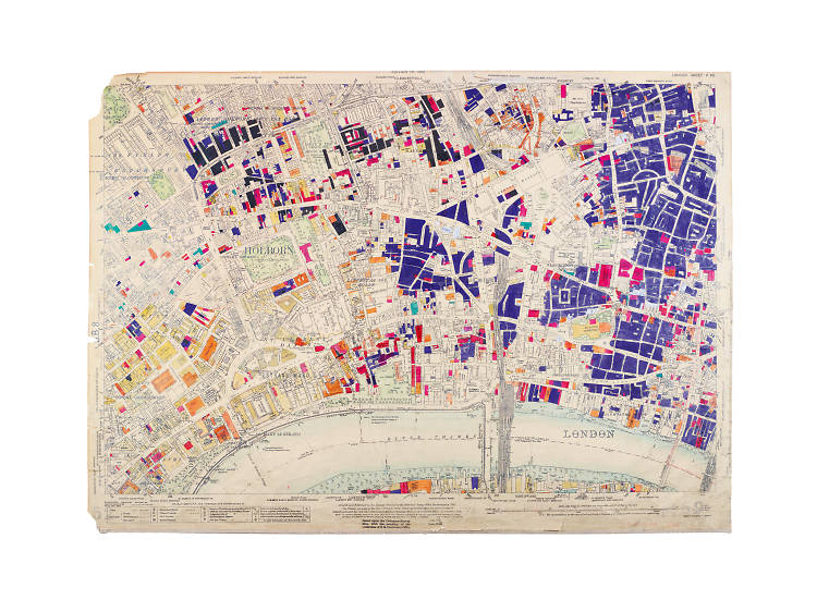
3. LCC Bomb Damage Map, 1945

This chilling map shows the extent of the damage caused by bombing in World War Two. The colour codes represent the degrees of severity, with black indicating where a building had been destroyed entirely, through to yellow showing minor blast damage. Although it represents great loss, the map was also used as a basis for reconstruction and future town planning. Go team London Country Council.

LCC Bomb Damage Map, 1945, London County Council Architect's Department

See the full-size map here

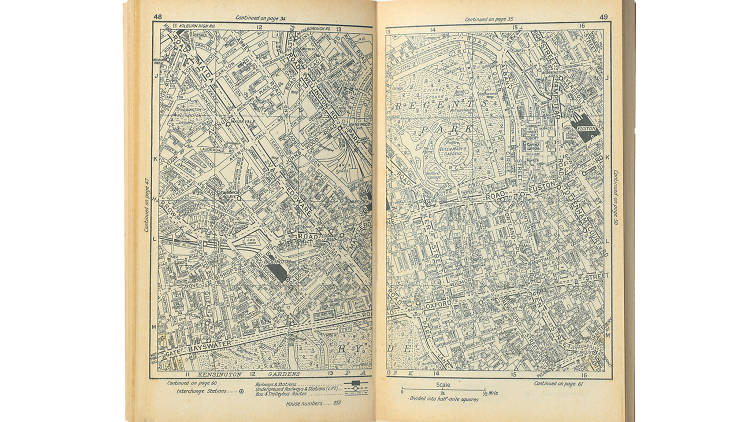
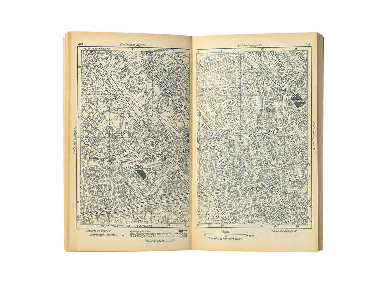
4. A-Z Atlas and Guide to London and Suburbs, 1936

If Ms Pearsall hadn't got lost on the way to a party in 1936, that A to Z atlas in the back of your car would never have existed. Pearsall decided to map London herself after an Ordnance Survey map failed to take her in the right direction. She walked more than 3,000 miles, mapping 23,000 streets and single-handedly created this hugely detailed book of routes, roads and streets. Thanks Phyllis!

A-Z Atlas and Guide to London and Suburbs, 1936, Phyllis Pearsall

See the full-size map here
Advertising

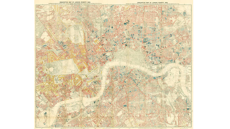
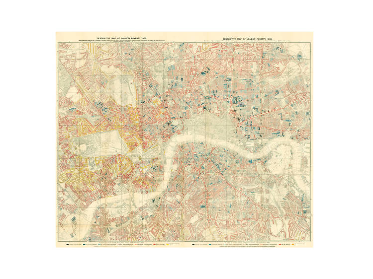
5. Descriptive Map of London Poverty, 1889

Nice guy Charlie Booth wanted to map out London's extreme wealth inequality at the end of the 19th century. He and his team wandered the streets to come up with this descriptive key, which shows the 'Lowest class. Vicious. Semi-criminal' bunch living right next to the 'Upper-middle and Upper classes. Wealthy' lot. Shack up everyone and watch your pennies.

Descriptive Map of London Poverty, 1889, Charles Booth

See the full-size map here

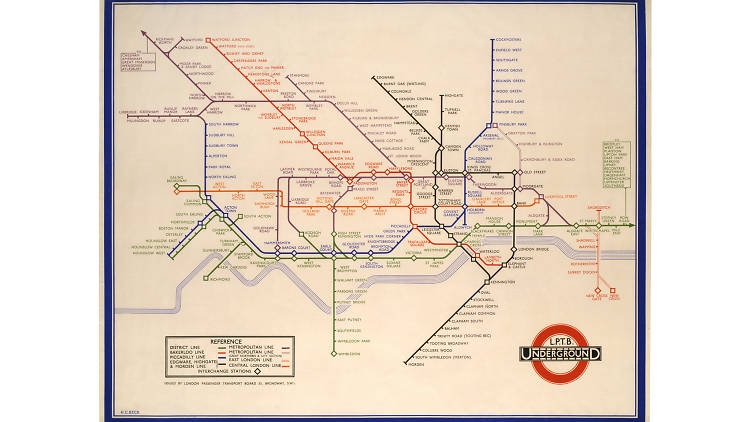
6. London Underground, 1933

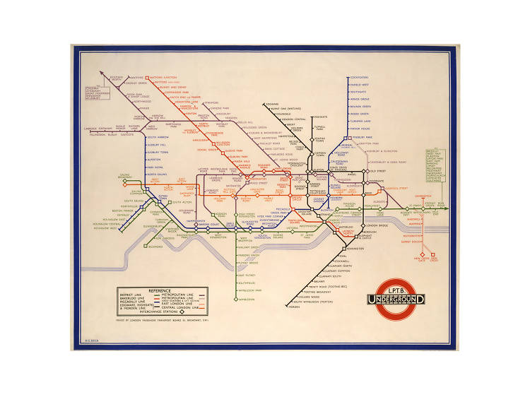
An ode to TFL, the original London Underground map may look really simple - but that was the beauty of it. Beck wanted to show that travellers didn't given a hoot about what was going on above them - all they wanted to know was the quickest way to get from Chalk Farm to East Putney via Bank and 1930s depression. This no-nonsense, streamlined approach is now the model for transport maps all around the world.

London Underground, 1933, Harry Beck

See the full-size map here
Advertising

7. Deaths from Cholera in Soho, 1855

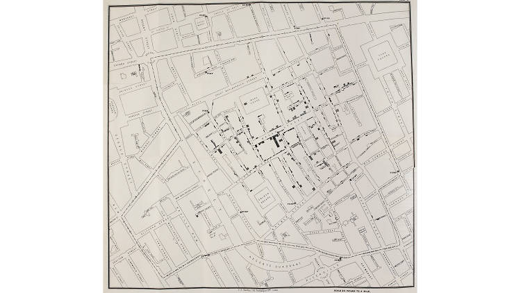
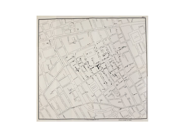
This scribble of lines is in fact one of the most important pieces of work in the history of disease prevention and, well, mankind. John Snow set out to document all the deaths from chlorea in Soho in 1854. By plotting them on a map, he was able to see that they concentrated around a particular water pump on Bond Street. Bam. Cholera was known to be a water-borne disease and the pump was disabled. Epidemic sorted. Kind of. 

Deaths from Cholera in Soho, 1855, John Snow

See the full-size map here

Check out more of London in pictures

Recommended
    You may also like
    You may also like
    Advertising